

- Chapter 1: 5 Best Case Practices for Your Online Store Navigation
- Chapter 2: WooCommerce Menus: Behind the Scenes
- Chapter 3: WooCommerce Product Categories: Through the Magnifying Glass
- Chapter 4: WooCommerce Product Filters: A Deeper Insight
- Chapter 5: WooCommerce Product Sorting: a Look Under the Hood
- Take-Home Message
Did you know that our attention span lasts no longer than 8 seconds? Shocker, isn’t it?
This means your online store has a short time capturing and retaining your customer’s interests. So how can you make sure your visitors are paying attention? The answer is simple. It all lies in the hands of good design and easy navigation.
One crucial thing efficient navigation does is to decrease bounce rates, increase time on site, resulting in satisfied customers and a profitable business. Who doesn’t want that?
Efficient navigation happens by using:
- Navigation menus
- Product filtering and sorting
- Product categories
This article will cover everything you need to know about online store navigation, creating your navigation menu, adding categories and Product filters, etc. So you’d better stick around!
Chapter 1: 5 Best Case Practices for Your Online Store Navigation

Develop a neat homepage design
One of the most important aspects of making a positive first impression is conveying what your store is all about. If your visitors don’t catch up immediately, you have a problem.
According to the Baymard Institute, “42% of mobile e-commerce sites do not have a homepage design that allows users to infer the type of site they’ve landed on correctly.”
In other words, visitors will be perplexed if they don’t understand what you’re offering or your website’s general theme. And you most definitely don’t want to annoy them when you’re trying to increase conversions.
Here’s an illustration of an e-commerce site that hasn’t fallen victim to this famous blunder and makes excellent use of a rational and relevant eCommerce homepage design: About You.
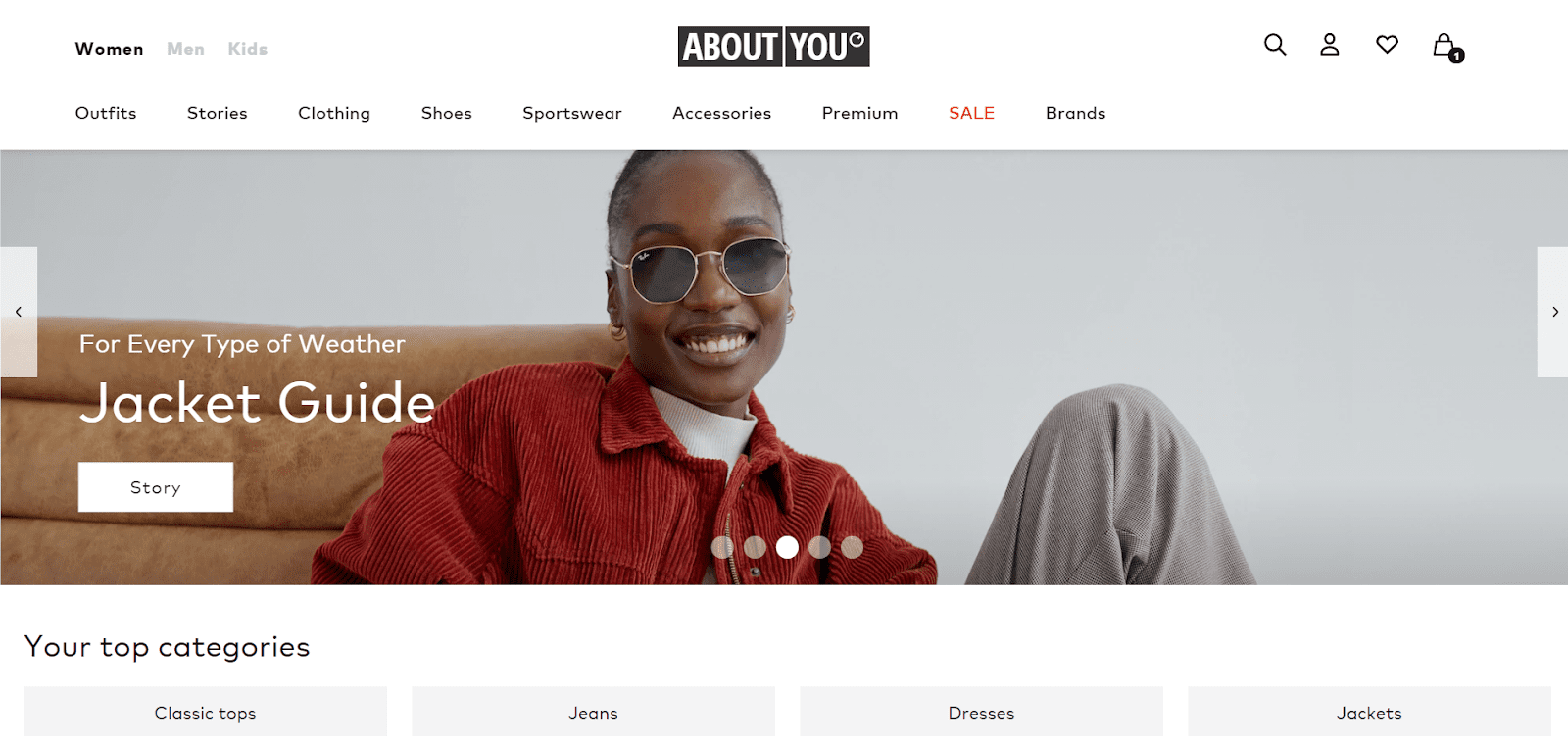
Let’s start with the name of the store. It immediately gives you a feeling of satisfaction and joy, knowing that the purpose of this eCommerce store is to make its customers happy. After all, it’s about them.
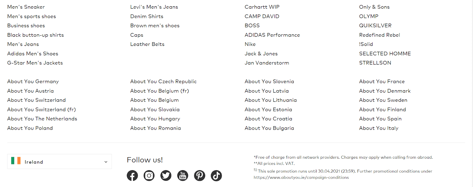
A quick look at their homepage shows that they are a clothing fashion brand that caters to women, men, and kids. It’s a very straightforward homepage, displaying carefully cut categories, a footer, countries from which you can access the shop, and their social media buttons.
The bottom line is that your homepage should be clear and transparent, and visitors should be able to grasp what you’re selling without having to scroll too far down. If you follow these steps, you should be in excellent nick.
Include various product categories in your navigation bar
Since the first level of product categories is concealed by default, users can’t say what site they’ve landed on without hovering over the main navigation. This makes it unnecessarily difficult for new users to grasp the site’s nature and product catalog choices.
Let’s take a look at Best Buy. Their full product catalog navigation was contained inside a single “Products” bar in the main navigation.
This unnecessary layer in the top hierarchy created problems for users during user testing because of “double-hover” navigation. It made it difficult for users to determine its kind of site and what products it offered.
But now, it looks like this. ?
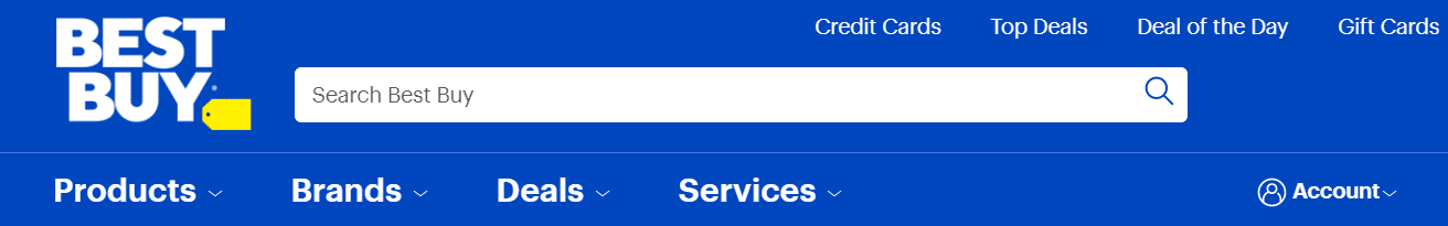
Much better, right?
Customers may experience numerous serious navigational issues if product categories are not shown directly in the main site navigation, so you’d better pay extra attention when creating your navigation menu.
Find the balance for your product categories – Too many or too few isn’t the answer.
Here’s how it works. If you have very few categories on your hands, users will have to hover over one category, click through to another, then another, and maybe even another to find what they’re looking for. You get the point, right?
That’s a lot of wasted time. However, requiring users to rummage through so many categories can be inconvenient. So what’s the catch?
Let’s take a look at Blue-Tomato’s website.
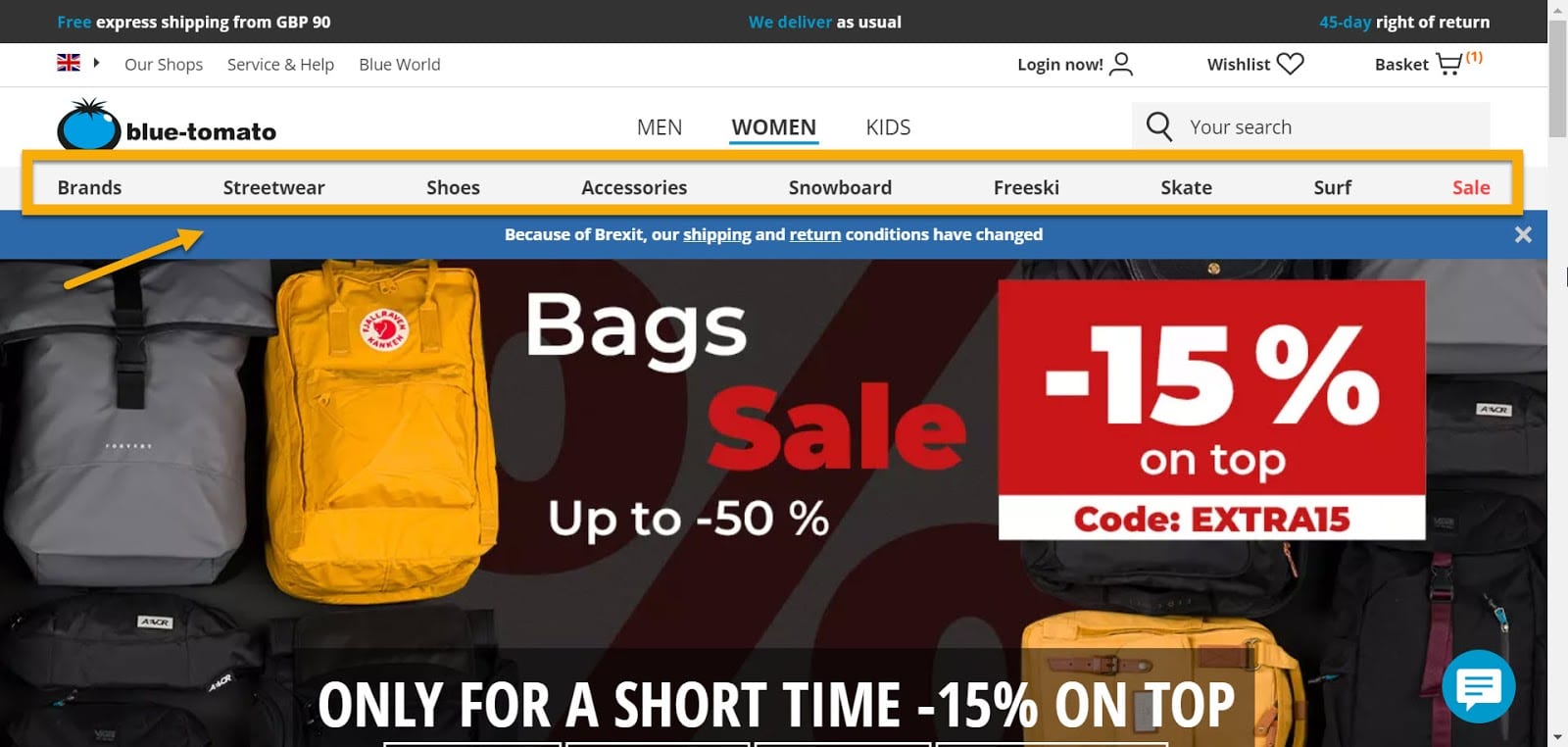
Blue-Tomato does a great job with its website navigation. They have nine categories clearly outlined around the header to see what kinds of goods or promotions are available right away.
There are enough product categories to keep things organized, but not so many that you become overloaded. This results in a pleasurable online shopping experience, which leads to a solid average session time and conversion rate.
Make use of internal search engines.
You can further simplify things by providing a search box so that your customers can type in whatever product they’re looking for. Just like this: ?
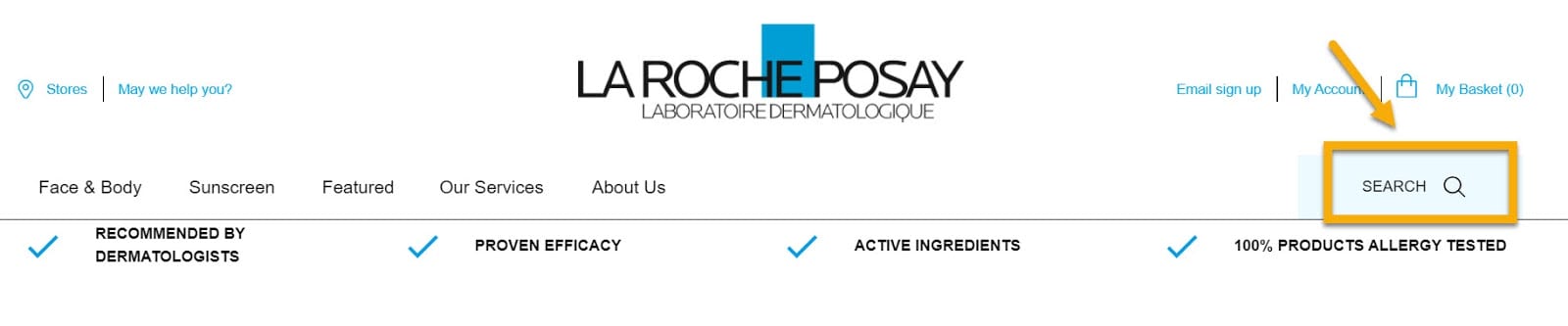
You can not compete with LaRoche Posay‘s website in this category, as the image speaks for itself.
Why spend countless hours trying to find a specific sunscreen when you can type in a keyword, and the rest will follow. Besides, you can always include an autocomplete option, like this one on Amazon‘s website.
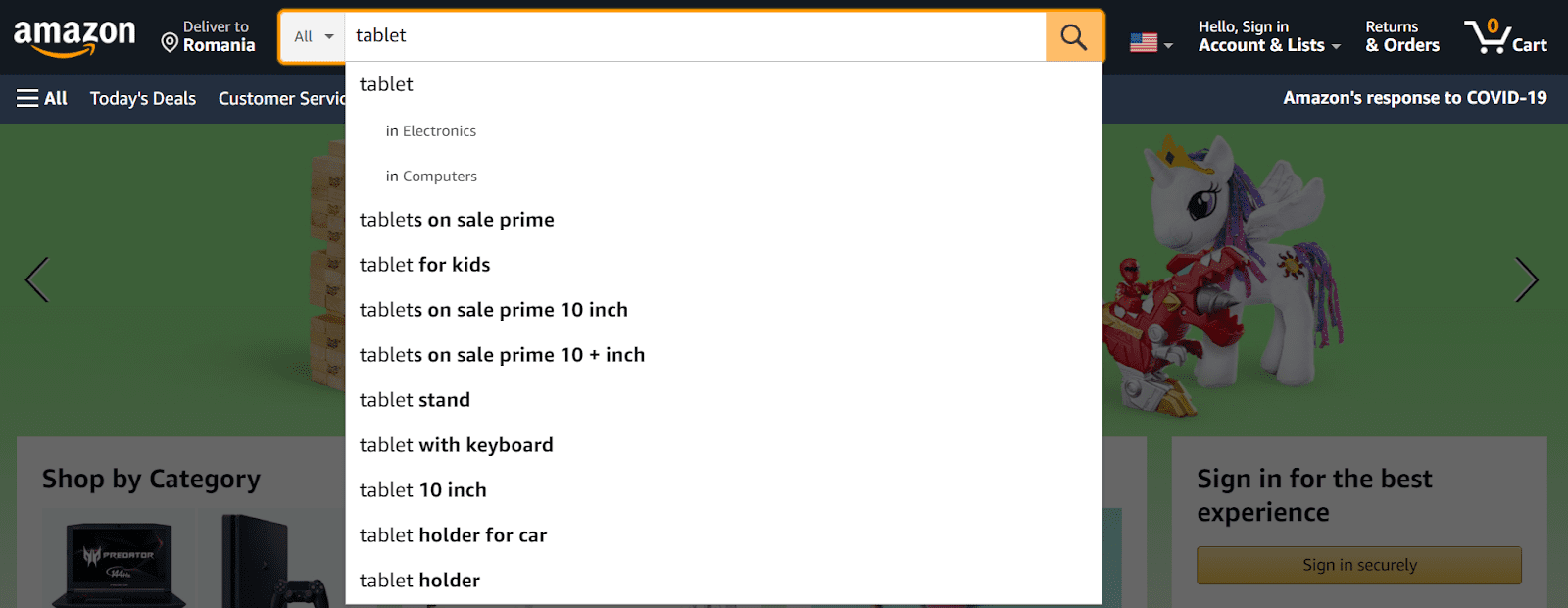
Who doesn’t like it when someone else takes care of their responsibilities? The goal is to refine your internal quest so that customers can find exactly what they’re searching for with the least amount of mental effort.
Make your website mobile-friendly
A website that is not mobile-friendly can cause visitors to abandon it and seek out another, more useful site to visit. Here we can analyze O’Neill’s example, a brand that sells quality clothing items focusing on sustainability and condition.
This is how their website looks upon accessing it via laptop.
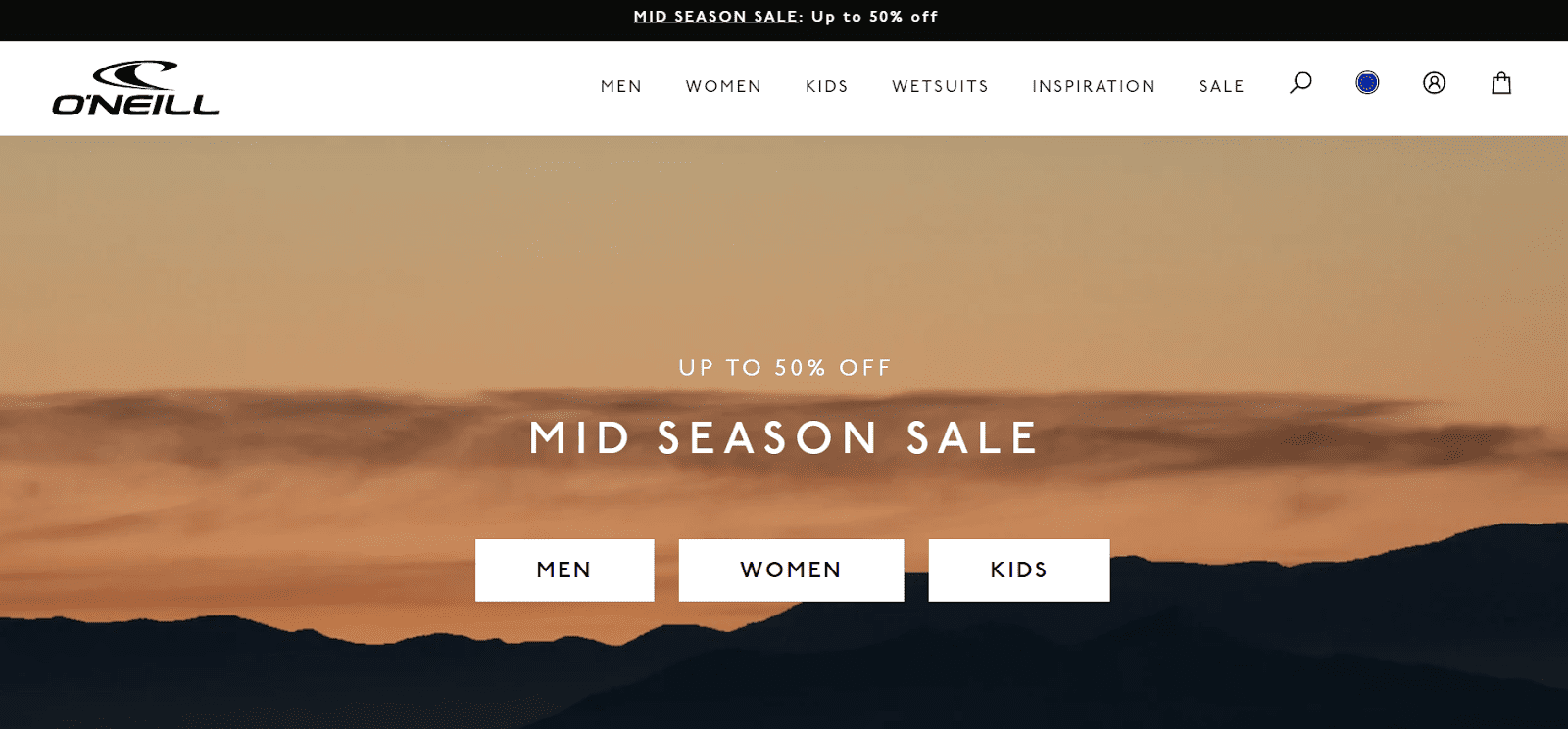
You can see that their product categories and navigation menu are very well put together, giving an extra boost to their UI. And, what’s even more, nothing changes if you access the website from your mobile phone.
Take a look: ?
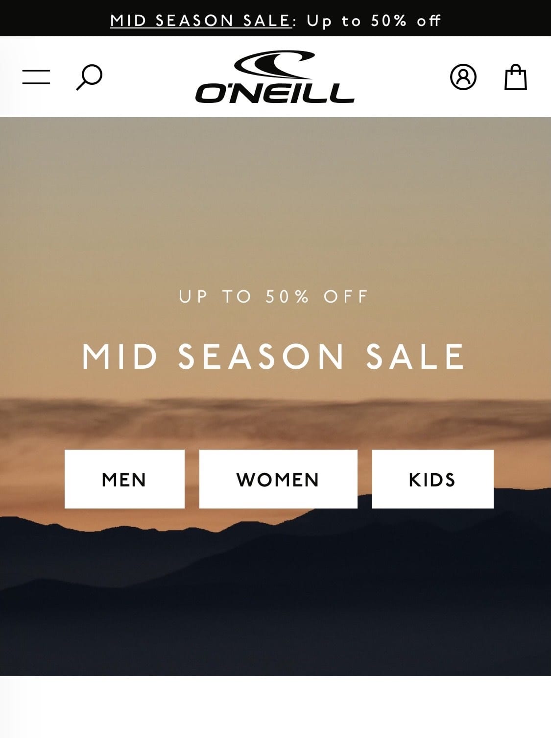
It’s safe to say that you won’t face any difficulties getting through their website regardless of scrolling on your mobile phone or PC.
The whole point of making your website mobile-friendly is to make your customers stick around and eventually compel them to make a purchase.
And another thing: Mobile-friendly websites are prioritized by Google’s all-important algorithm.
Google is even ranking sites based on their mobile experience; you might have heard about mobile-first indexing. Your SEO content will be more successful, and your site will rank higher in search results if you optimize your website to be mobile-friendly in styling and content.
And now, we’ve come to the rather technical side of the online store navigation.
As I mentioned a bit earlier, proper online store navigation happens via:
- Navigation menu
- Product categories
- Filtering
- Sorting
Chapter 2: WooCommerce Menus: Behind the Scenes
When designing a website, the various elements of the page should work together to guide visitors through the site easily. The menu is one feature that significantly impacts your site’s user experience and navigation.
A website menu is a set of linked items that allow users to move between various pages or parts of a website. Depending on the content and nature of the website, there are multiple types of menus, such as dropdown menus; navigation menus; sticky menus; hamburger menus, and sidebar menus.
What interests us is the classic navigation menu, so let’s explore a couple of examples.
Online Store Menu Inspiration
Bohemian Traders
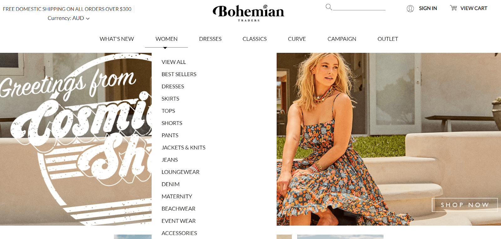
This eCommerce website can easily navigate between clothing pieces based on the latest arrivals, events, accessories, or sale items thanks to a cosmopolitan touch to the website design and a clean and fresh menu.
Patagonia
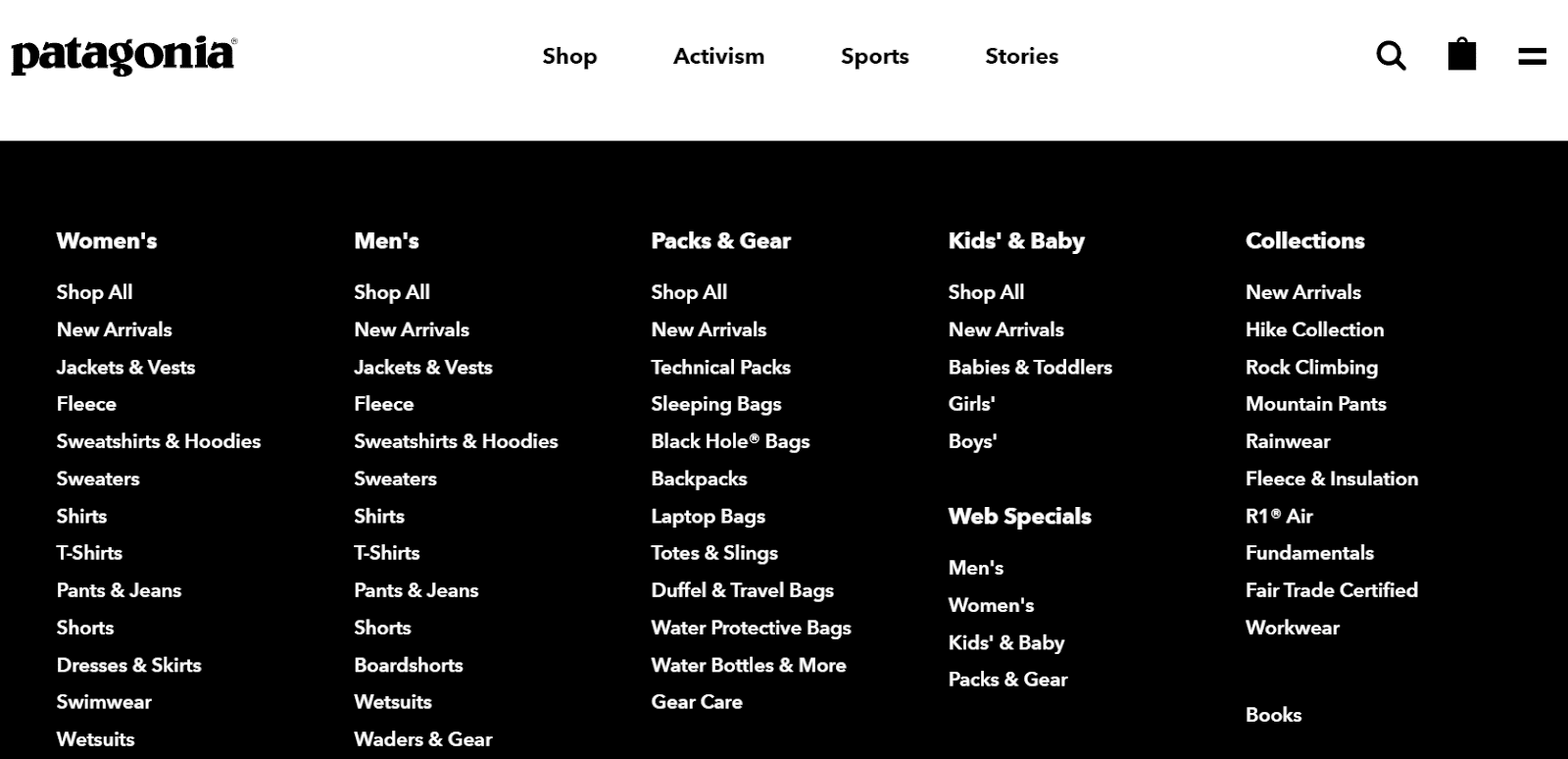
As you can see, Patagonia’s menu is instead on the minimalist side, not too colorful, not too sumptuous, but a mix of everything that works. Four items on the main menu and a large section of subcategories are what keep customers coming back.
Fjällräven
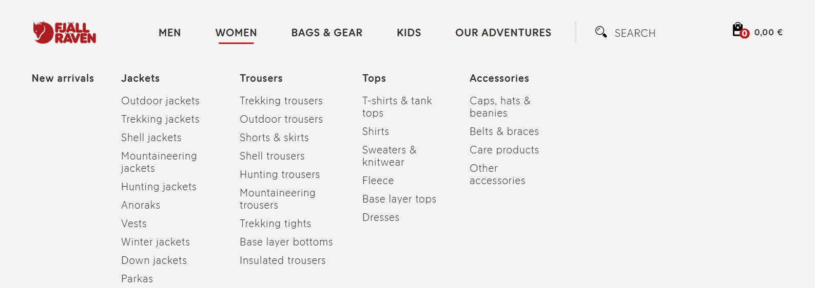
Yet another one on the minimalist side. Fjallraven’s menu clearly outlines everything you need to find what you’re looking for.
Dealing with Navigation Menus in WooCommerce
Now, let’s get on the tech side of things a bit. To create a navigation menu, go to your WordPress Dashboard → Appearance → Menus.
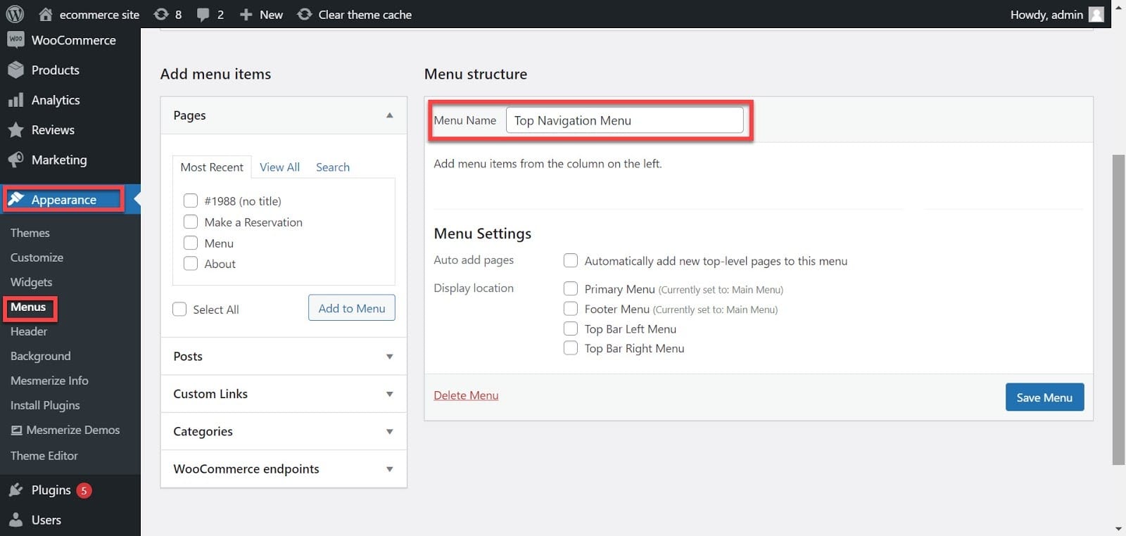
First, give your menu a name, such as “Top Navigation Menu,” and click the “Save Menu” button. This will broaden the menu area, which will appear as follows:
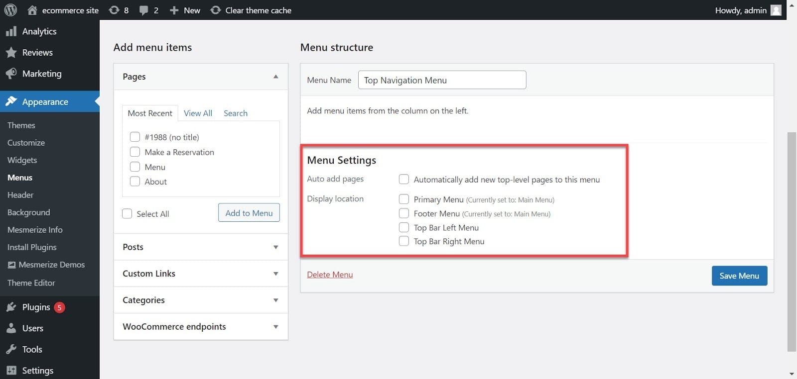
Here you can select which pages you want to include in the menu. As seen in the previous examples, adding your product category pages to your menu for online stores is good.
So, this means that you’ll need to create some. You’ll just have to tick next to your desired pages, then hit the “Add to menu” button. Next, from the “Menu Settings” option on the right-hand side of your screen, select where you want your menu to show up. For example, is it the primary menu or a top bar left menu?
Next, just click “Save Menu.” And you’re done.
What About WooCommerce Mega Menus?
Mega menus are the most effective tools for directing users to subordinate websites. A mega menu makes all the options visible at once, laid out horizontally and vertically. Most online stores and eCommerce websites are insufficient without a mega menu on their board.
Let’s see an example of a mega menu.
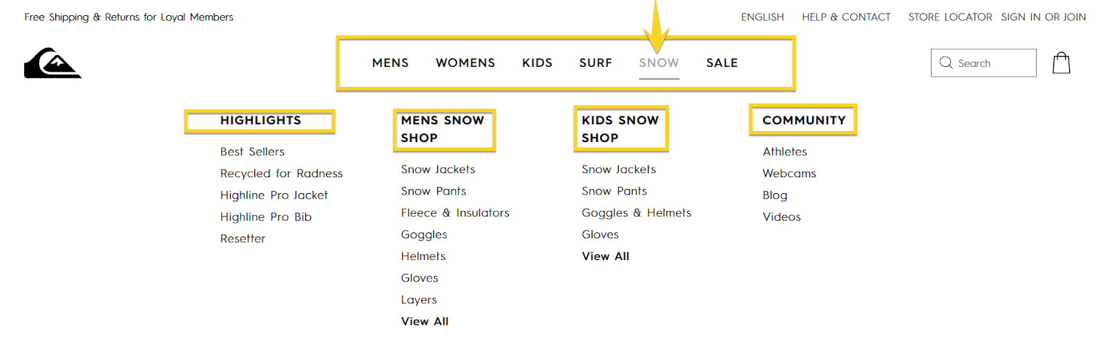
Quicksilver has an elegant and clean mega menu. Its website uses a wide-scale mega menu with centered menus, large whitespaces, and a unified black font to fit the minimalist style. However, this is not a mega menu; it does not have dropdowns and subsections inside its menu items.
As you can see, mega menus can offer your customers many options in your main menu, and you can even include images or videos.
Go to Dashboard → Plugins → Add New → WP Mega Menu to add mega menus. After you activate the plugin, the WP Mega Menu icon will appear on your Dashboard. ?
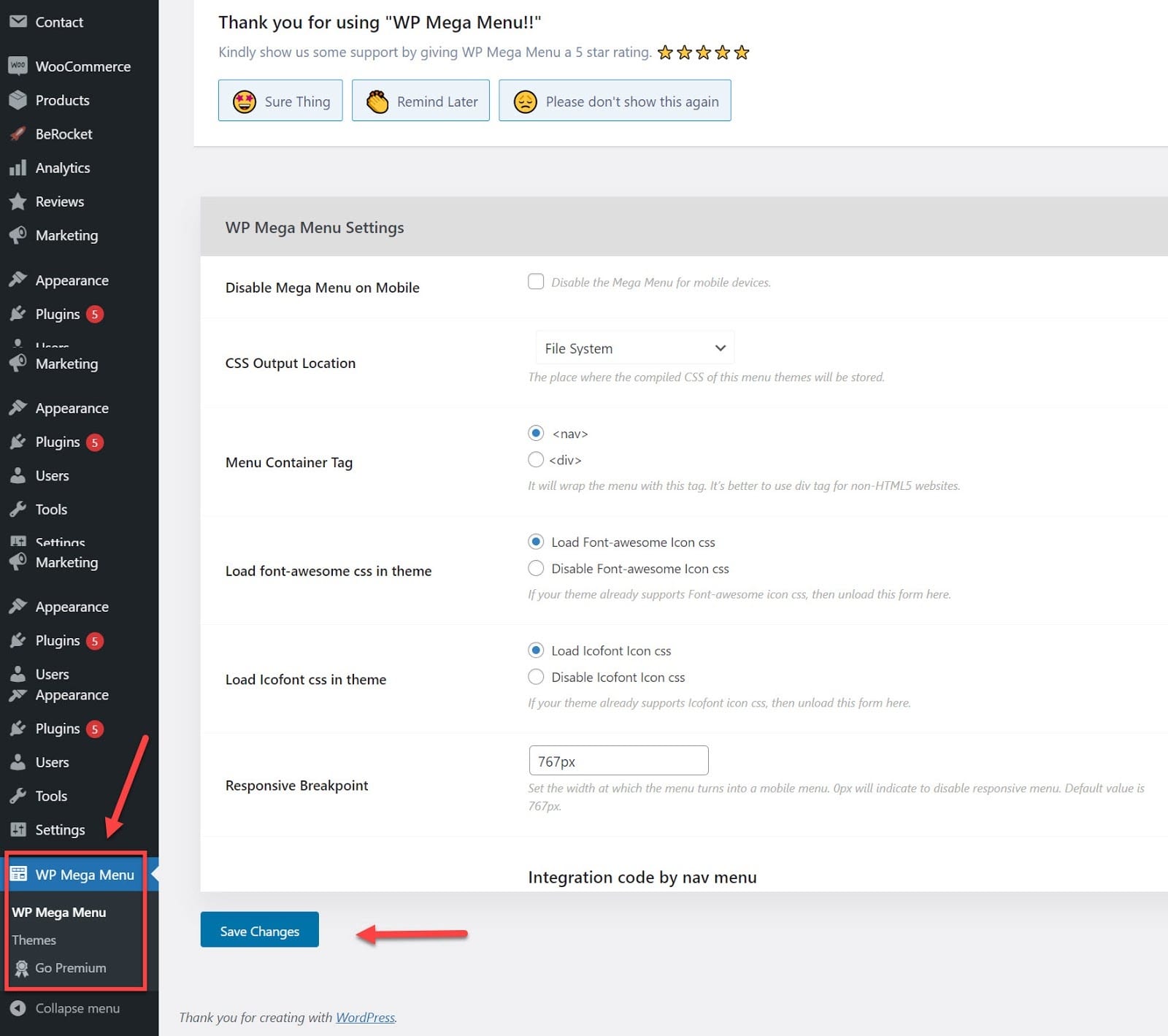
Here are several features for which you can use this plugin:
- Drag and drop menu builder
- Social icons
- Branding in logo
- Search bar in the menu area
- Unlimited colors
- Menu labeling
- Mobile-responsive navigation
Determining what elements are most important to your customers is the first step in developing successful navigation. You risk losing a potential customer to a competitor if they can’t find what they’re searching for. So give yourself time to explore your options and set up successful store navigation.
Chapter 3: WooCommerce Product Categories: Through the Magnifying Glass
Product categories allow you to group related products to be shown in different sections of your website. Products can be classified into many groups, and you can also use subcategories whenever you have a promotion or deal on your website.
In other words, product categories are like the salt and pepper in your dish. Without them, you’ll feel like something is missing, and the ones who will prove you right are your customers.
For example, let’s say you sell smoothies. First, you can group them into fruit smoothies or vegetable smoothies. Next, you can group them by their dominant fruit or vegetable.
Product Categories Inspiration
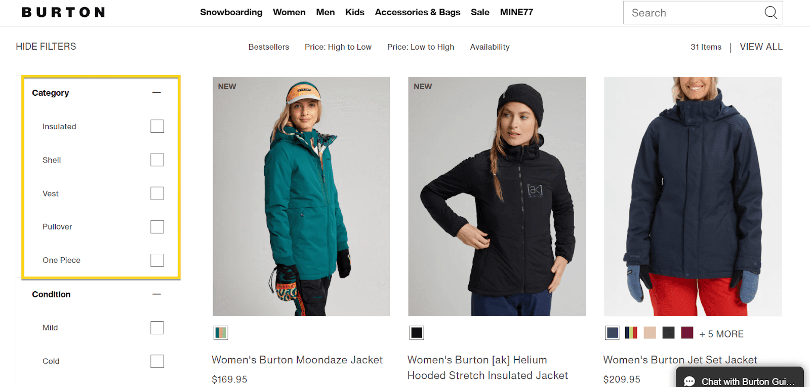
Burton
The folks at Burton are using their product categories in filters on the left-hand side. We’ll talk about filters in our next chapter.
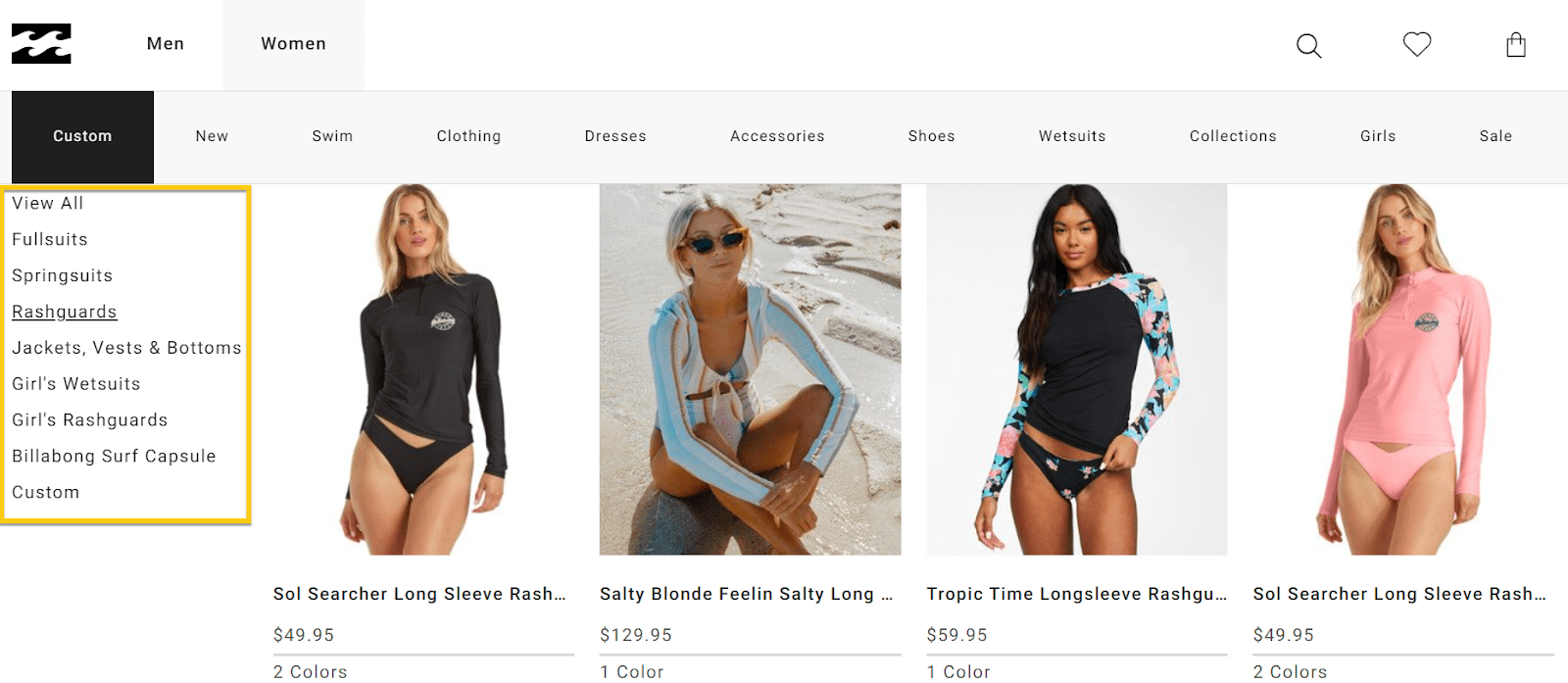
Billabong
The peeps at Billabong include their product filters in the main menu to make navigation seamless. Sounds just about right, doesn’t it?
Viator
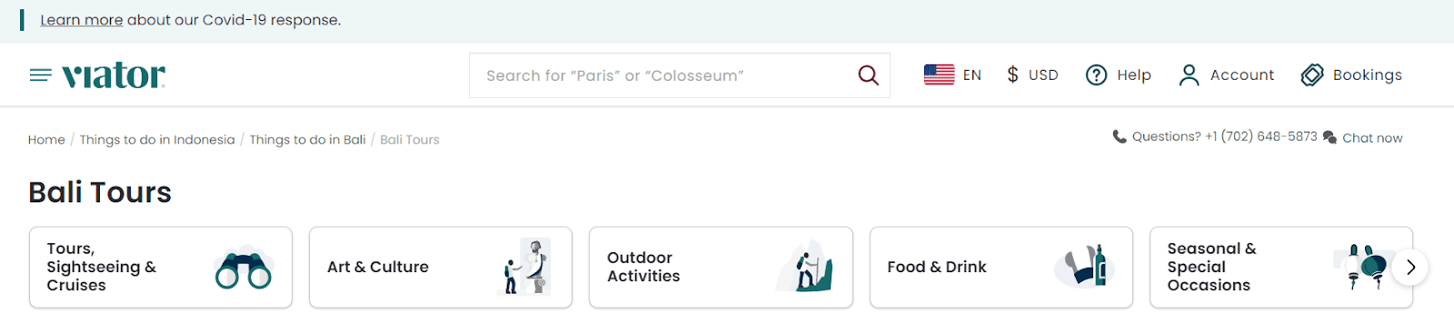
Product categories differ from vertical to vertical. So whether you sell food items, cosmetics, fashion, travel packages, you must create logical categories that will help your visitors find their way to your “Add to cart.”
Viator has a terrific way of grouping its products into categories. For example, they sell travel tours grouped based on the scope of the time.
They realized that tours should be grouped according to the traveler’s interest. Some are interested in sightseeing, others in arts & culture, others in discovering the gastronomy of a place. It all makes sense, doesn’t it?
Dealing with Product Categories in WooCommerce
Product categories can have a flat structure, such as a list of product types. The following are examples of common product categories.
- Industry based categories
- Functionality, such as running shoes or surfing equipment
- Customer needs, such as winter clothes versus summer clothes
- Demographics, such as children’s items or women’s goods
- Performance, such as racing bicycles or city bicycles
Now that you know what’s up with these categories, it’s time to find out how to create them for your online store. By going to Product -> Categories from the left of your screen. ?
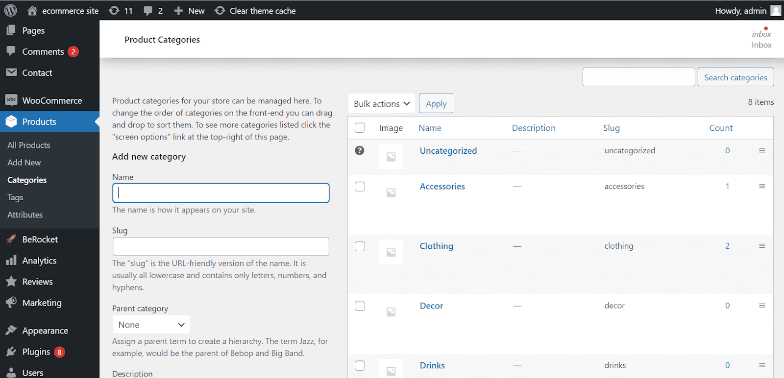
You can name your category on the left field. Then, the moment you hit enter, the slug will automatically match the category’s name, but you can always edit it if you’d like. A slug is the part of a URL that identifies a particular page on a website.
In other words, it’s the part of the URL that explains the page’s content. For example, your carrier has the following URL: https://myawesomeonlineshoestore.com/red-slippers and the slug is ‘red slippers.’
This is your site: https://myawesomeonlineshoestore.com, and what comes after “/” will define a page and get the technical name of “slug.”
Now, let’s go back to where we left our story.
If we’re defining this category as a subcategory for a more significant category, you can select the parent category below the slug field. So now, if you take the entire URL and paste it into a browser, you’ll see a page containing all the products belonging to that category.
Going back to WordPress product categories, you can see all your categories on the right-hand side. Here you can make edits and delete the ones you no longer need.
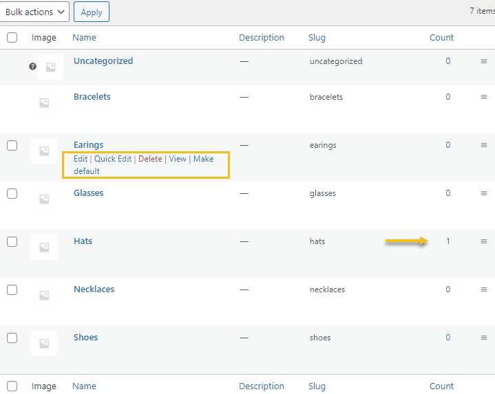
There’s also a column called “Count,” where you can see how many of your products belong to a specific category.
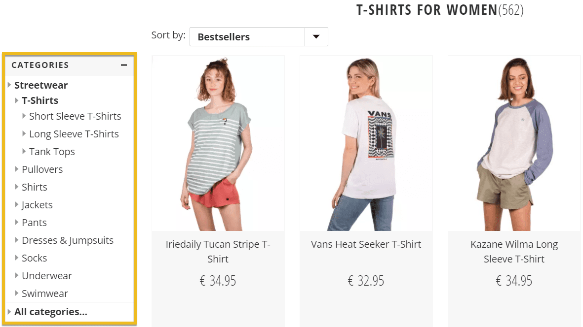
Product categories do precisely what you assume they do. They allow you to categorize your products, thus making your website neat and clean. Each time a product is defined, it must be assigned to one of your product categories. In addition, product categories are used to set default accounts and make category options available for groups of products.
Remember that categories are always a good option if you want your visitors to find their products easily. Categories help them narrow down their search and save valuable time and effort.
Chapter 4: WooCommerce Product Filters: A Deeper Insight
Filters help customers narrow down their product searches based on various factors such as price, color, size, and feedback. Filters on your storefront can help customers find items more efficiently by allowing them to browse the way they want.
However, these filters make use of custom-made product attributes. They are product characteristic that affects a customer’s purchasing decision. Businesses use SKUs to classify goods, but customers search for products differently.
They use simple terms like “big family tent” and “affordable jacket.” As the folks at WooCommerce recommend: “Never use product categories or tags for things like size, color, brand, make, shape, features.” These will be defined as attributes.
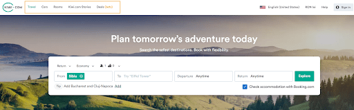
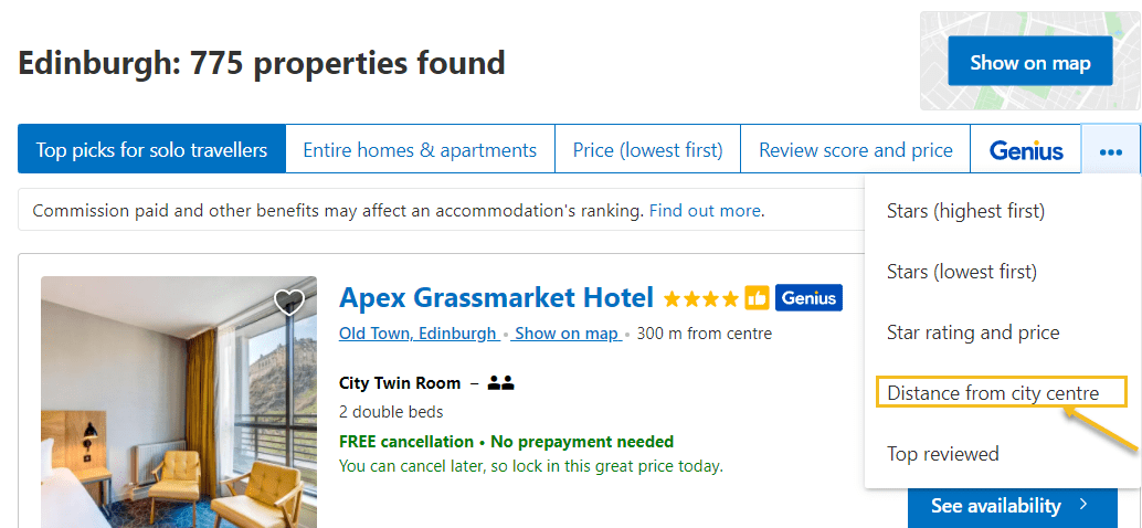
For example, if you’re searching for your next travel destination, your keyword could be something like “accommodation,” “price,” “location.” Let’s see how Booking can help you find the exact information you’re looking for
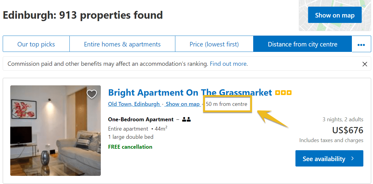
As you can see, your options can be categorized according to your personal needs regarding the distance from the center of a city. Pretty cool, right?
When customers are searching for a specific product, they want to quickly obtain information about it and choose the best option that suits them. That’s why it’s critical to list the product features that are most valuable to the consumer. Therefore, product attributes must be correct and informative.
Product Filtering Inspiration
Booking
Booking.com uses price product filtering, amenities filtering, or rating filtering. Make sure to know what your users want and adjust filters accordingly.
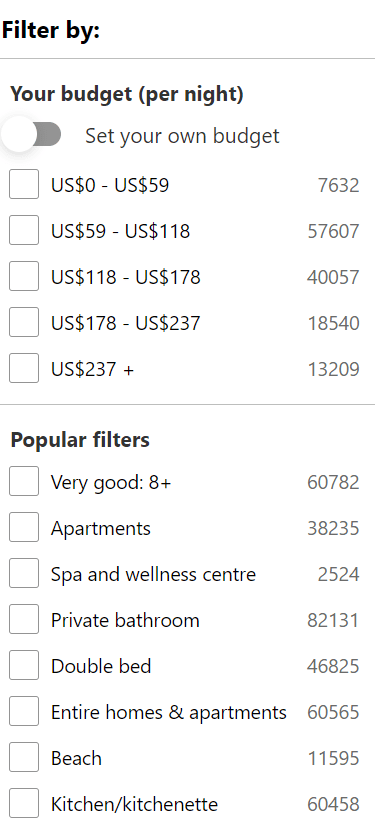
The peeps at Booking.com know what they’re doing to make sure their visitors enjoy a smooth sail on their website. The filters they provide offer everything one needs to have at their fingertips to decide upon their next journey. No fuss, just the real deal.
Amazon
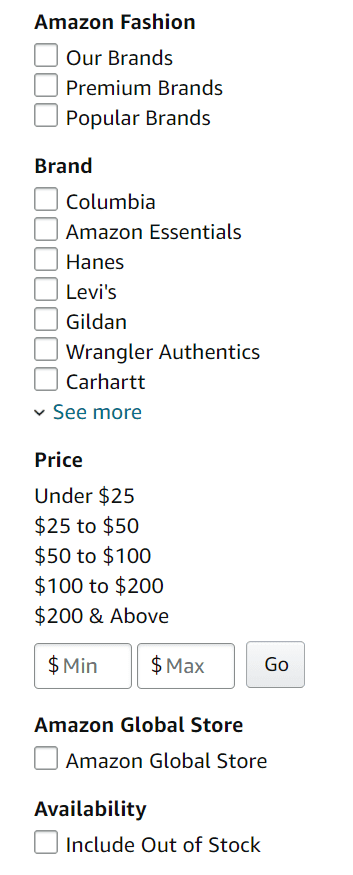
The left Sidebar on Amazon allows you to filter and narrow down your search results. As you can see, you have many options from which you can choose. And because Amazon is a marketplace, filtering by the brand is a must. Not having to scroll through everything and scrape out every little detail gives that extra boost to your UX and UI.
Scott Bikes
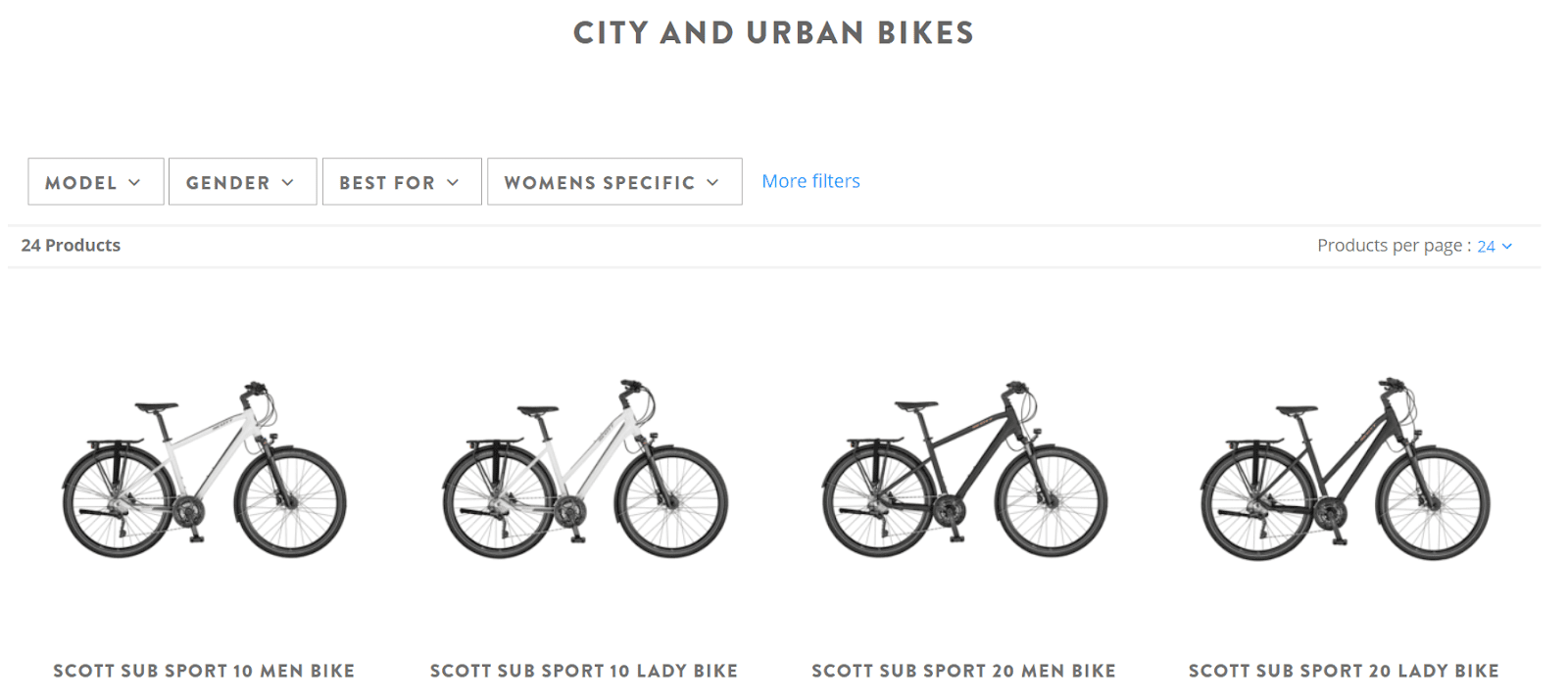
Scott Bikes is well-known for its large category of professional bikes ranging from mountain to urban city bikes. A bike for everyone. From their filtering menu, you can easily find the bike of your choice without spending countless hours figuring everything out.
Dealing with Product Filtering in WooCommerce
Using WooCommerce for your online store automatically implies that the product filtering is tightly linked to your product attributes. Don’t worry, it sounds confusing, but we’ll get there soon.
Upon assigning attributes to products, your customers will be able to use them as a filtering method. This filtering process is often done by WooCommerce widgets that enable users to filter the items and goods they’re searching for.
So let’s dig deeper and find out how you can add Product attributes to your online store. ?
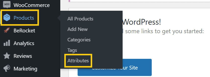
Assume you have a t-shirt in different aspects, such as a regular circle neck, a v-neck, and a u-neck. Or maybe a t-shirt that comes in various colors. You want your customers to choose the style that works best for them. The only way to accomplish this is by defining attributes. So the first thing you need to do is go to your WordPress Dashboard → Products → Attributes.
You can set the name of your first attribute according to whatever category you’re referring to. It can be color, size, style, and much more. For this example, we will use ‘Style.’ Just head over to ‘Products -> Attributes -> Add new attribute.’
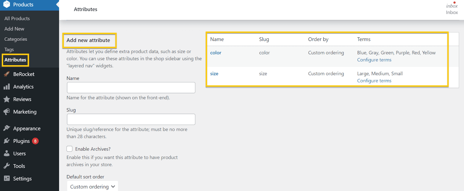
On the right, you can see other attributes I have previously added. Now, let’s add the “Style” attribute. Just type in the name as shown below.
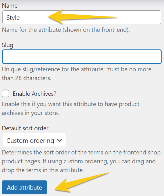
Like in the category situation, the moment the name is inserted, a slug will be generated. Just hit “Add attribute,” and you’re all set from this point on.
Here is an example of Burton’s website and how they choose to display different styles of their T-shirts.
Now, how can you make your filters show up in your store?
Filters are some widgets that you can drag in a sidebar, below the header, or the footer.
Widgets are available inside the WordPress dashboard if you go to Appearance → Widgets.
On the left-hand side, you can see:
- Filter Products by Attribute – it displays a list of attributes to filter products in your store.
- Filter Products by Price displays a slider to filter products in your store by price.
- Filter Products by Rating – it displays a list of star ratings to filter products in your store.
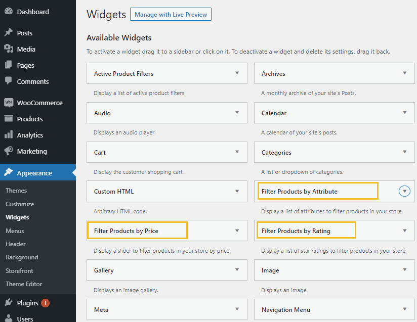
When you want to activate these widgets, you just have to click on that arrow pointing down and select your desired location from the dropdown.
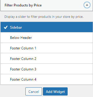
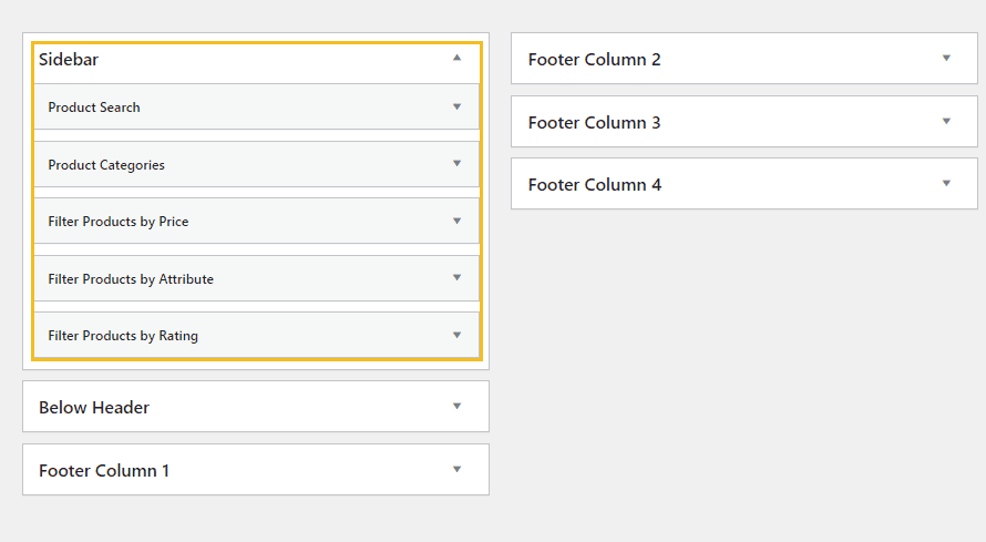
These filter widgets can be placed inside the Sidebar, footer columns, or below the header. First, let’s select the Sidebar (it’s the most common placement for filters). Then click on “Add Widget.”
You’ll see these placements and their components on the right-hand side of your screen.
Our current Sidebar contains a product search widget, product categories, and three types of filters.
When you select the arrow next to each widget, you see some editing options. First, let’s look at the attribute filter widget.
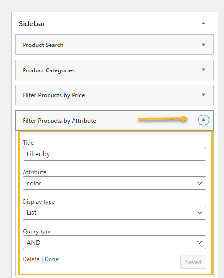
Start by naming your filter inside the “Title” field.
If you have several attributes such as style, color, size, you can add the filter multiple times and select the point from the “Attribute” dropdown, as seen above. The “Display type” will let you choose the style of your attribute filter: list or dropdown. Next, select whether you want users to filter by “AND” or “OR” query types.
AND – If a user selects two attributes, only products which match both features will be returned.
OR – If a user selects two attributes, products that match either attribute.
Users often want to filter by two attributes (e.g., size M, color: black); “AND” should be selected.
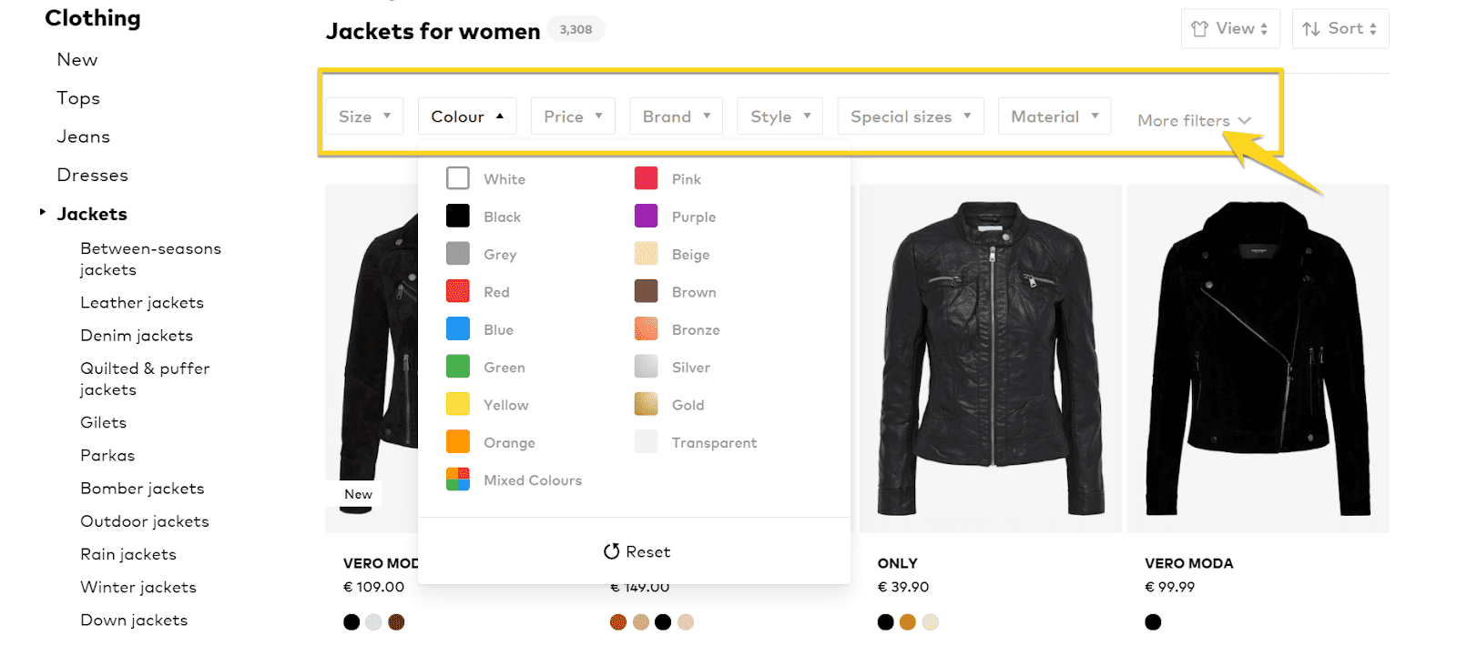
Now, here’s an example of online store filtering. The product categories are shown in the Sidebar, and below the header, there are the filtering options by different attributes.
WooCommerce product filtering plugins
Let’s say the options presented above are not enough. For this example, one of the most popular plugins out there that can supercharge your filtering options is WooCommerce’s Advanced AJAX Product Filters.
Go to your ‘Dashboard Plugins → Add New’ and type into the search bar the plugin’s name.
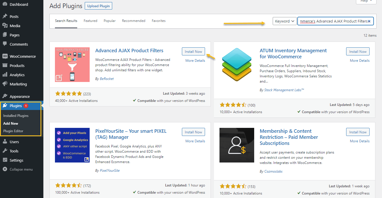
Next, click on “Install Now,” then “Activate.”
The moment this is done, you will see a new menu item on the left-hand side of your WordPress Dashboard called “BeRocket.” To add a product filter, go to ‘Product Filters->Filters->Add Filter.’
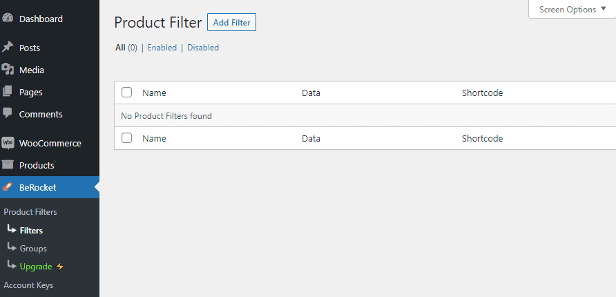
Using the ‘ Conditions ‘ option, you can name your filter and decide which pages it will appear on.
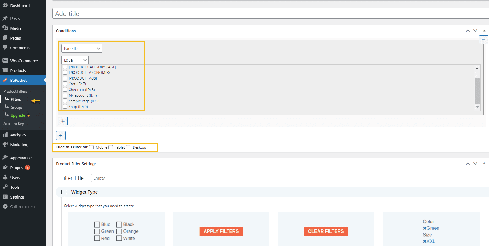
What I love about this tool is that they use messages and other explanatory visual cues to help you navigate it:
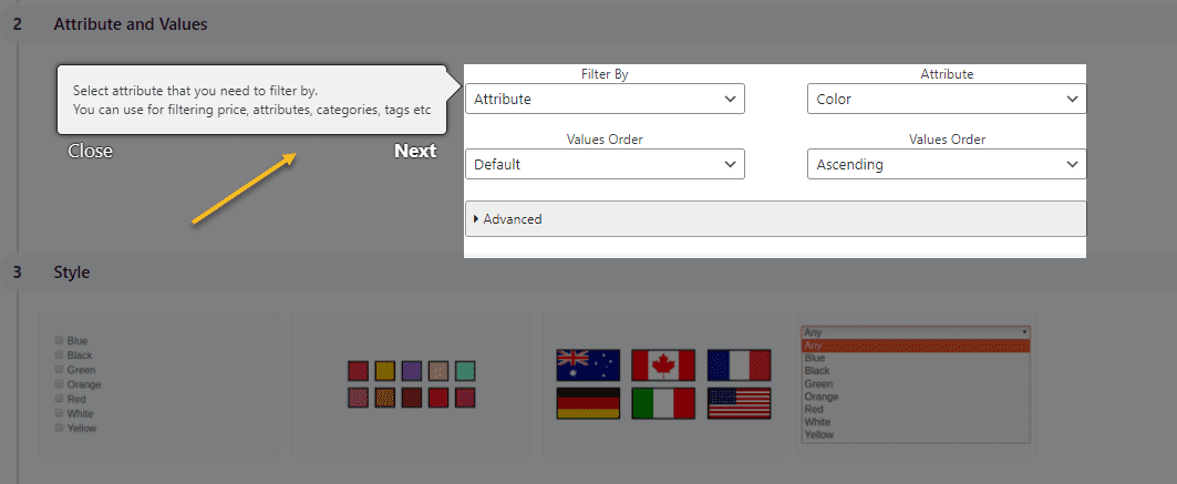
If you follow these cues, your filters will be set.
Now, for some final settings, after saving all your filters, head over to ‘Product Filters’ You’ll see this: ?
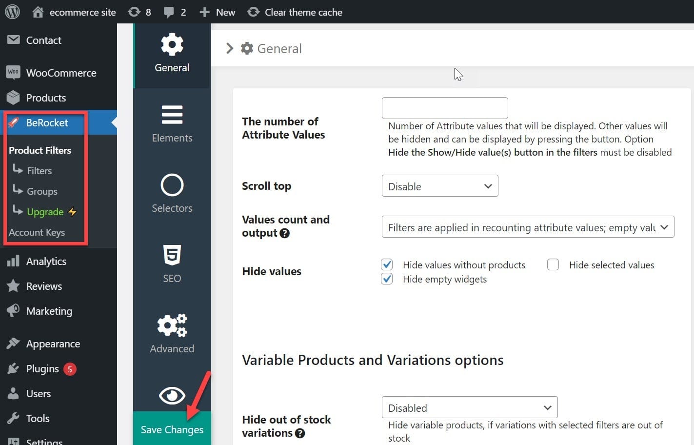
Here, you can decide how many attributes to show and style inside the ‘Design’ options. There are quite a few things you’ll need to check in here. Take them one by one, and see which fits your purpose better.
Once you’re done, hit ‘Save Changes and you’re all set.
Chapter 5: WooCommerce Product Sorting: a Look Under the Hood
Introducing search features allows your customers to browse and sort your products, just as you type keywords into Google to find the sites you seek. It lets them quickly and efficiently focus on the kinds of products they need.
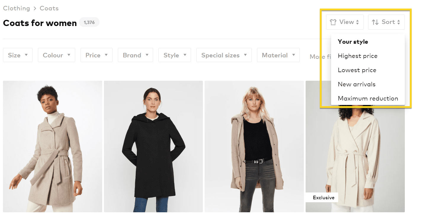
Efficient sorting and searching for product listings will go a long way toward assisting consumers in finding and purchasing the items they’re looking for. Sorting is another method of helping consumers find the ideal thing for them. The newest object, price (low to high, high to low), and A to Z or Z to A are the most popular sorting methods. Just like this:
Product Sorting Inspiration
Did you know that some sites offer you location and distance from one point to another besides the traditional sorting options? Just like Booking does.
Dealing with Product Sorting in WooCommerce
A lack of order and sorting on your online store can lead to frustration and a poor customer experience. Customers who spent a lot of time and were empty-handed are less likely to return to your store. Good product findability and sorting, on the other hand, reduces customer anxiety and is as important as price and quality.
WooCommerce gives your users the following sorting methods out-of-the-box:
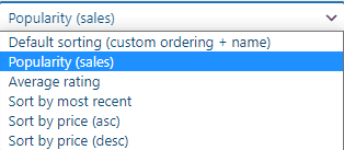
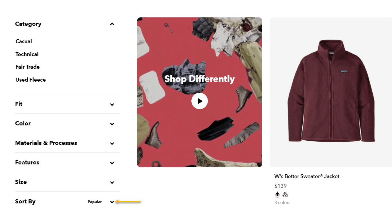
Its default sorting is alphabetical. But here, you can change it to your own defined sorting. If we go to Patagonia’s website and look for fleeces, their default sorting is by popularity.
Some other sites have other custom-made sortings, probably based on a combination of factors: bestsellers, price, profit, etc. So, how can you set up your default sorting?
First, you will need to go to Products → All Products.
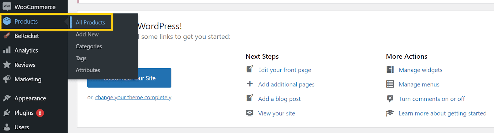
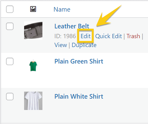
Then, once all your products are displayed, hit the Edit button.
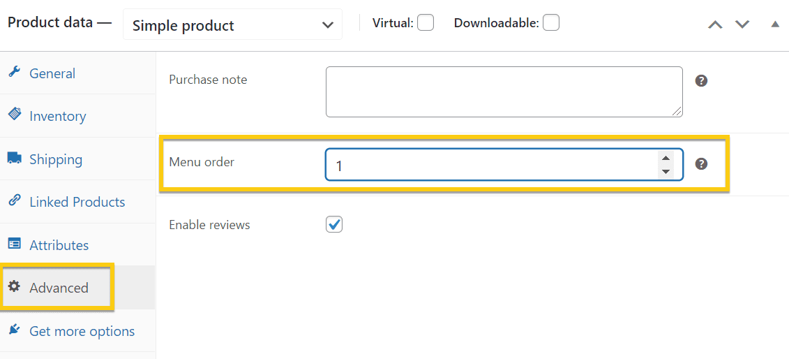
Scroll down to the ‘Product Data’ section in the editing panel. The “Menu Order” choice can be found under the “Advanced” tab. In this area, you can set the Product’s location.
These steps are pretty self-explanatory. However, you can always choose to use a plugin that will do the work for you.
Next, after defining the custom order, it’s time to tell WooCommerce to show your products in your custom or default order. Start by going to your WordPress Dashboard → Appearance → Customize.
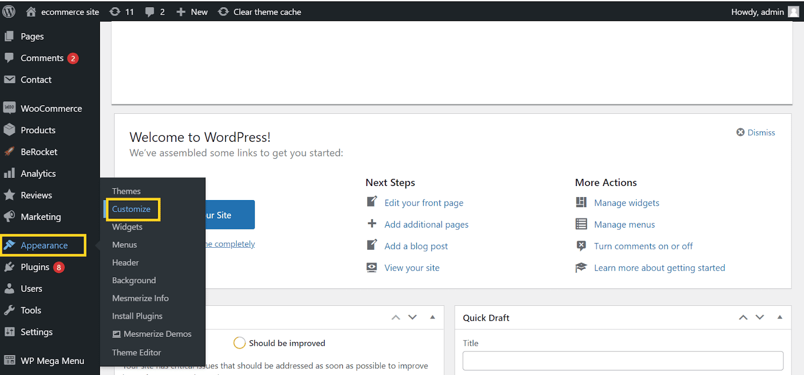
From there, go to WooCommerce → Product Catalog.
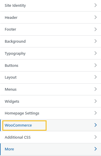
Check for the ‘Default Product Sorting’ choice.
When you change your mind and realize you want to show your potential clients products sorted by popularity, you can come back here and select “Popularity” from the dropdown menu.
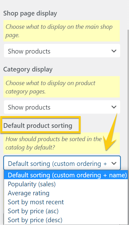
Don’t forget to hit ‘Save’ and ‘Publish’ when you’re done!
Now, the users will see your preferred sorting option on your online store. But they can always change it to their preferred sorting option.
WooCommerce product sorting plugins
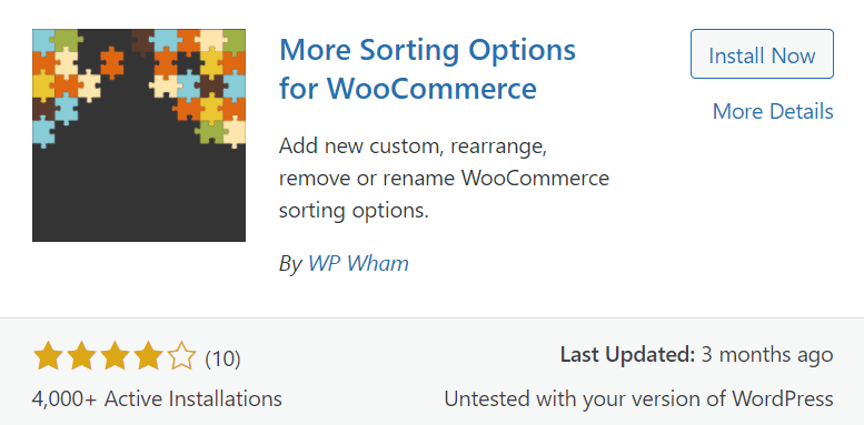
There are tons of Product sorting plugins available, but we’ll demonstrate how this one works for simplicity.
With this plugin, you can add A to Z and vice versa titles, SKUs, stock quantities, product IDs, total sales, and much more. You can also include your custom meta sorting options. You can also rearrange the order of sorting options (including WooCommerce default) on the front end. You can also rename or delete the default WooCommerce sorting options in the premium edition.
Take-Home Message
Often brands will think, “Let’s just slap together some good-looking pictures and a few categories and call it a day.”
However, as our experience has proved, one should always pay close attention to the minor details that ultimately make a game-changer difference.
The tactics outlined in this article should cover the basics that will positively affect your online store.
Are there any other strategies for navigating an e-commerce website that you’ve considered useful? Let us know in the comments section below!

Gabriella is a Digital Content Writer and Marketer with a zeal for all things WordPress. When she’s not researching and drafting the upcoming articles, you can find her in the open air exploring the outdoors with her dog.


Comments are closed