
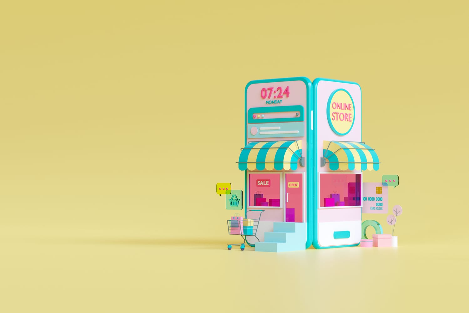
Do you ever get a sense of satisfaction when you browse an online store? A sense of comfort comes from a well-designed user experience, an appealing user interface, and the feeling that someone cares when you’re offered free shipping, discounts, or even free packaging?
If yes, then there’s a high chance you’ve stumbled upon a well-designed online store. Needless to say that today’s fast-changing market and digitalization are rapidly changing and driving customer expectations.
As a result of this digital transformation, companies are forced to change their business models and adapt to the new market reality. Today’s customers expect relevant content in the format and on the device of their choice. What this means is that your journey determines your strategy.
For this reason, creating a strong online store with a fresh perspective is crucial.
In today’s article, we’ll walk you through some best-case practices when it comes to creating your online store, tips and tricks, what kind of strategies work best, and which are the ones you should avoid using.
Shall we get started? ?
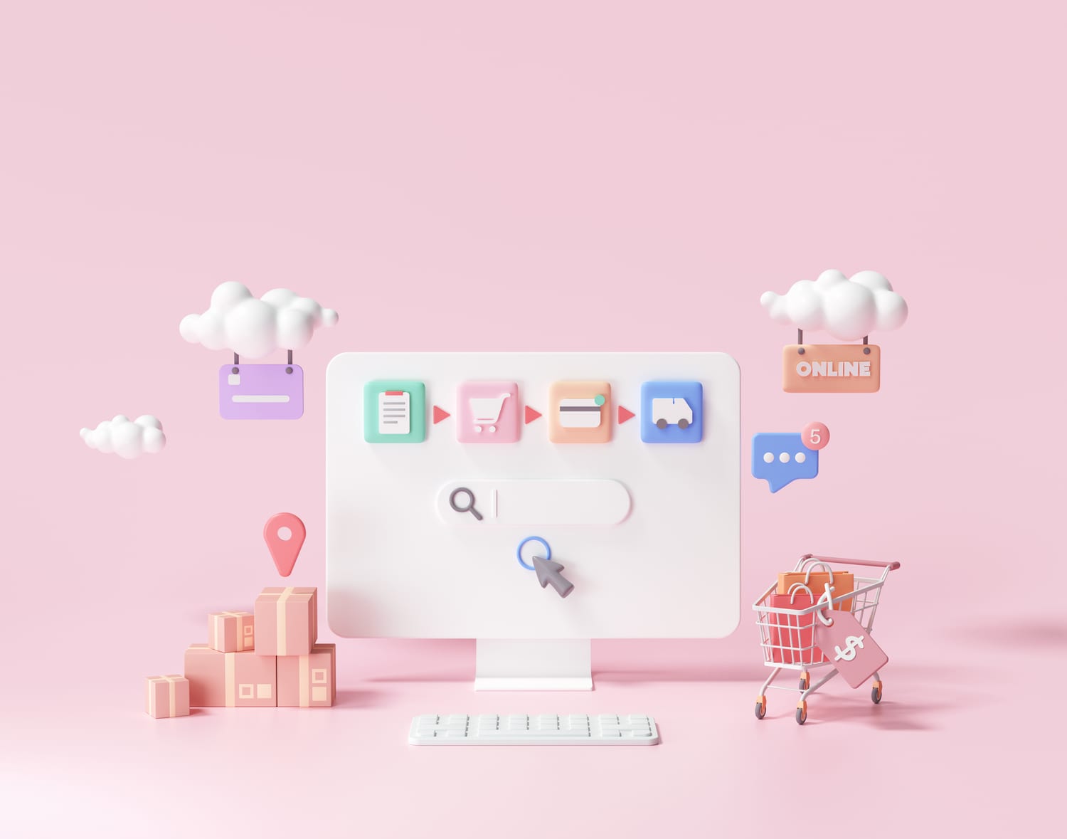
5 Benefits of a Well-Structured Online Store

What exactly is a well-structured online store?
In short, a well-structured online store is a type of website that has clean sections, categories, subcategories, and easy navigation. Structured content has been divided into independent parts to make its behavior more straightforward, thus leading to a positive user experience. Win-win, right?
So let’s see what exactly is that.
- Increased likelihood of Google boosting your online store
A strong, user-friendly site structure helps Google understand what your site is about and where it can find information, including which information it should value and display prominently. As a result, a good site structure can boost SEO by convincing Google that the site is useful and valuable to real people.
- A well-structured online store keeps you from competing with your content
Assume you’re selling 20 different types of flower vases. Even though each product is unique, it is hard to create a copy for each product that isn’t at least very closely related. As a consequence, Google will have no idea which of the product pages is the most significant. Alternatively, you’ll be competing with your products for a high ranking.
- A well-structured online store facilitates navigation
Make use of categories, tags, filters, and filtering options to improve navigation. The fewer steps a visitor makes till it reaches the desired product, the higher the conversion rates.
- A well-structured online store means scannable content
When you don’t have many complex decorative elements in your site’s design, your content comes alive. Visitors can scan content near the top of a website and can easily find what they are looking for. This is where categories and subcategories come into play. Customers will more likely stick around for more if they can find an item without having to scroll through different sections of your website.
Now, tell me, can you scan this?
No? Thought so. And yes, this is happening in 2021.
- An organized online store leads to an increased ROI
Nobody likes to spend hours on a messy-looking website without any relevant outcome at all. If this is the case, people will exit your website faster than a one-legged man in a butt-kicking competition. Jokes aside, this is one of the most crucial aspects you should consider when creating your online store.
Now that you have an idea of what a well-structured website can do for your business, let’s see a couple of best practices, tips and tricks, and examples of noteworthy websites. ?
10 Best Case Practices for Your Online Store
- Fruitful Product Demos
While you can create stunning product images, they may not significantly impact customer purchasing decisions. This is why some eCommerce stores go further than traditional marketing images to stand out.
For the sake of this example, we’re going to take a look at Ikea’s Augmented Reality app that allows customers to have a better user experience and visualize their product placed in their environment.
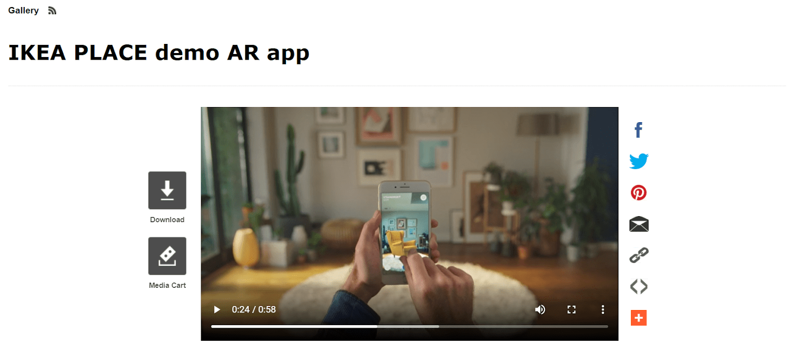
Let’s be honest for a second. How many times have we asked ourselves whether that piece of furniture or product will suit us or will look the same as we’ve pictured it in our head? This is what effective product demos can do to your online store. In other words, they increase the chances of a purchase happening and provide useful insight about a specific product while also giving you a positive experience. Win-win, right?
2. Appealing Images
I know you probably hear this a lot, but do you consider it as relevant as it actually is? The internet is made up of visuals. When we navigate websites, we rely almost entirely on our visual senses. Marketing experts agree that images are effective tools for engaging viewers.
As per Jeff Bullas, an internet marketer, 67% of online shoppers believe that product images are more important than customer reviews or product features. That is why it is critical to select the most appealing and appealing images that will capture your customer’s attention.
Let’s take a look at the example below. Here we have the famous online fashion store About You, which is well-known for its remarkable appearance. See for yourself:
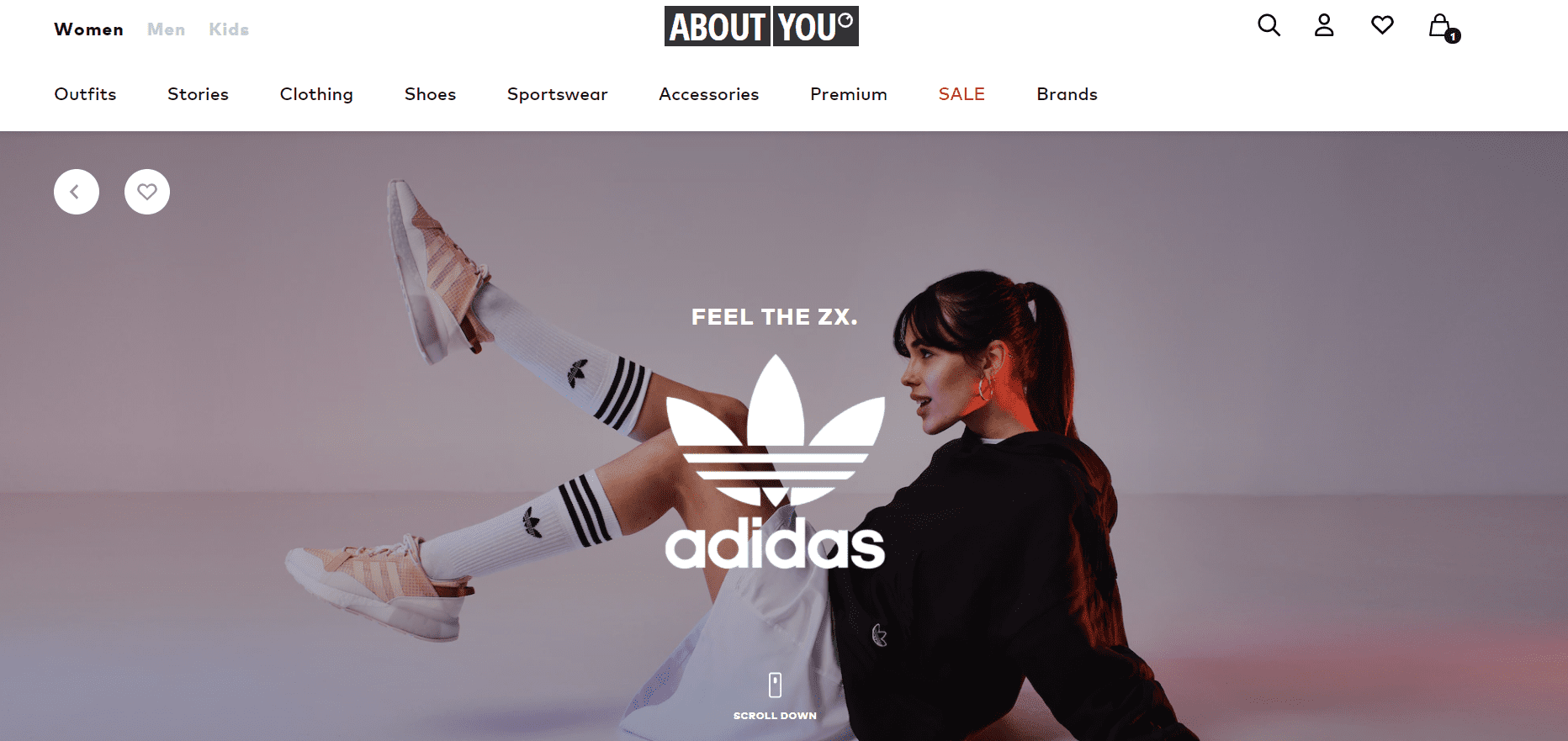
High-quality product images assist potential customers in visualizing the product in their hands. Why is this so? If you’ve ever seen a customer checking out products in a physical store, you’ll notice that they will pick out items they like and examine them in great detail.
Because they can’t physically touch the item in your online store, elevated images will help them envisage themselves as owners of the product, which increases your conversion rate.
3. Live Chat Support Boxes
The distinction between an offline salesperson and an online store is that a salesperson may respond to a potential customer’s questions on the spot… which can sometimes lead to a transaction. However, with online stores, you don’t have this kind of guarantee. So what can you do?
By adding a live chat system to your eCommerce shop, you give your customers the ability to ask questions about your goods while also allowing you to answer them right away. This is how Ride Store and Canyon Bikes do it.
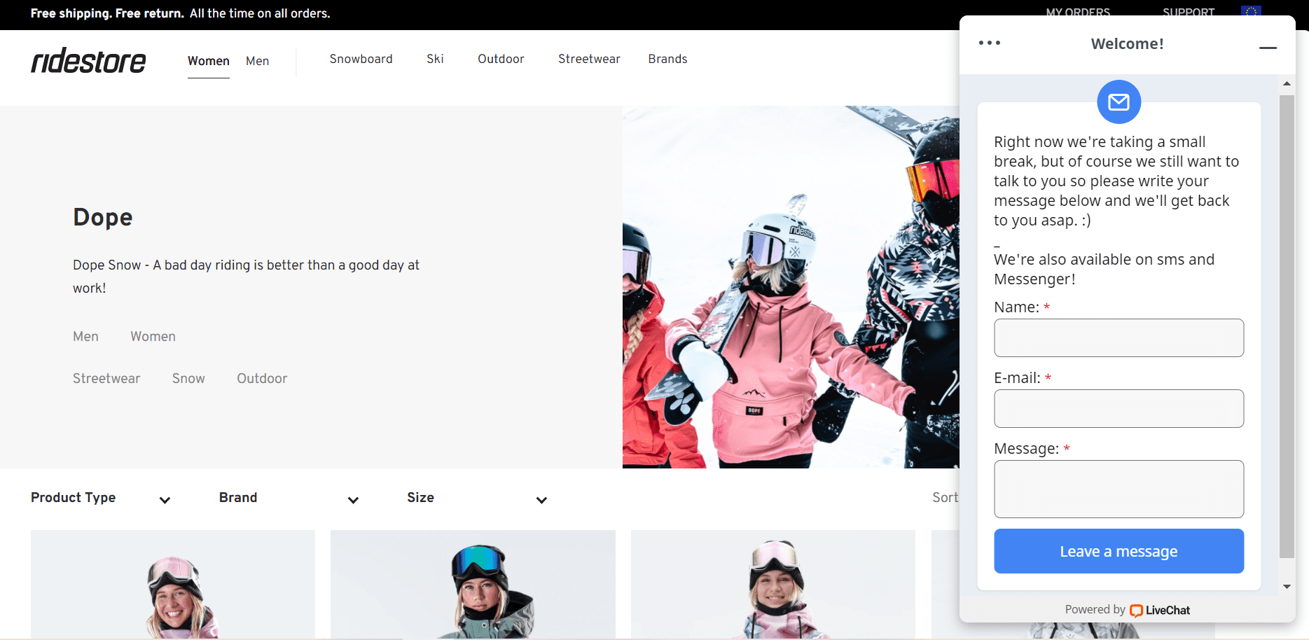
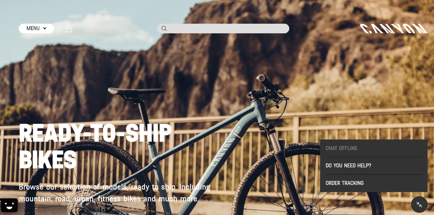
In an online situation, you might not even be aware of why people leave your website. You can’t handle on-the-spot questions or objections because… well, there isn’t any way to handle them unless you start using live-chat boxes.
4. Responsive Design
These days, almost every new client requires a mobile version of their website—one design to work on your iPhone, iPad, notebook, and Kindle. In the end, it all comes down to one thing: all screen resolutions must be compatible. When will the craziness come to an end? Well…it won’t. This is why it is utterly important to have a website that is responsive and mobile-friendly. Let’s take a look at Etsy.
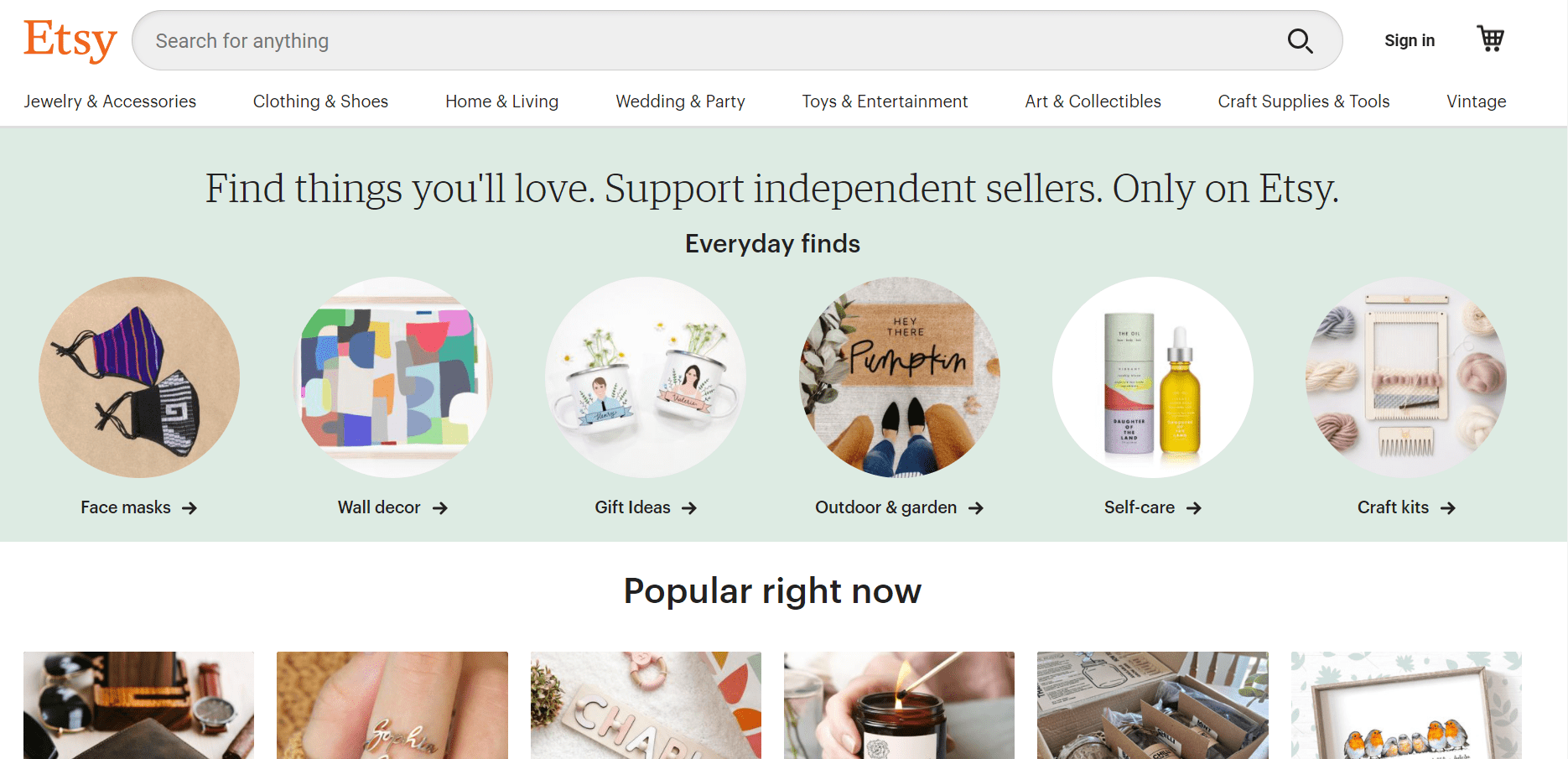
Etsy is an online marketplace where anyone can buy and sell handmade or vintage items. Etsy’s mobile site works well on both smartphones and tablets. If you want to do your shopping on Etsy, there is a prominent search bar and a button to open their App. They’ve also used a popular grid format with photos, which many mobile sites use, to keep the display clean and simple.
What’s the takeaway? The simpler you keep your website, the easier it will be to make it mobile-friendly.
5. Display Viewing History
Companies struggle to create and generate relevant content for their customers. The concept of implying products that complement the item they just purchased (“Customers who bought this item also bought”) is definitely not new.
Take a look at Amazon’s strategy.
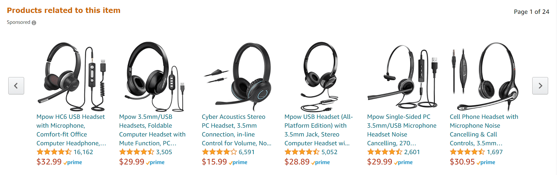
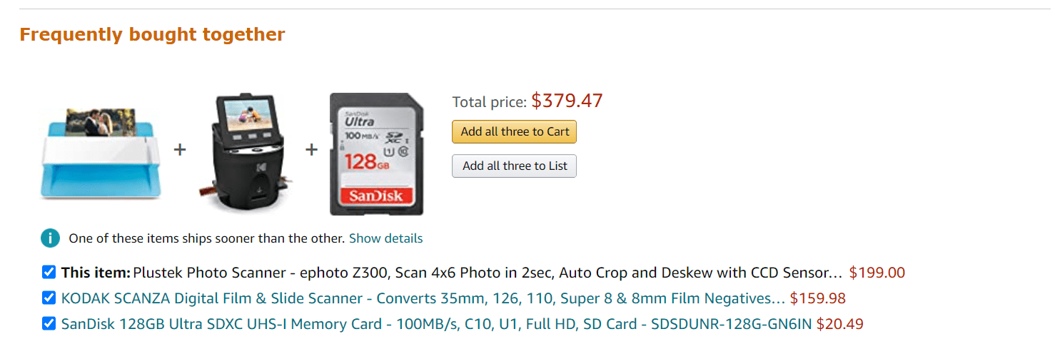
Amazon monitors your browsing history and recommends items from the same brand that you’ve previously viewed. Furthermore, they make it simple to browse items that may interest you in their “Inspired by your shopping trends” block.
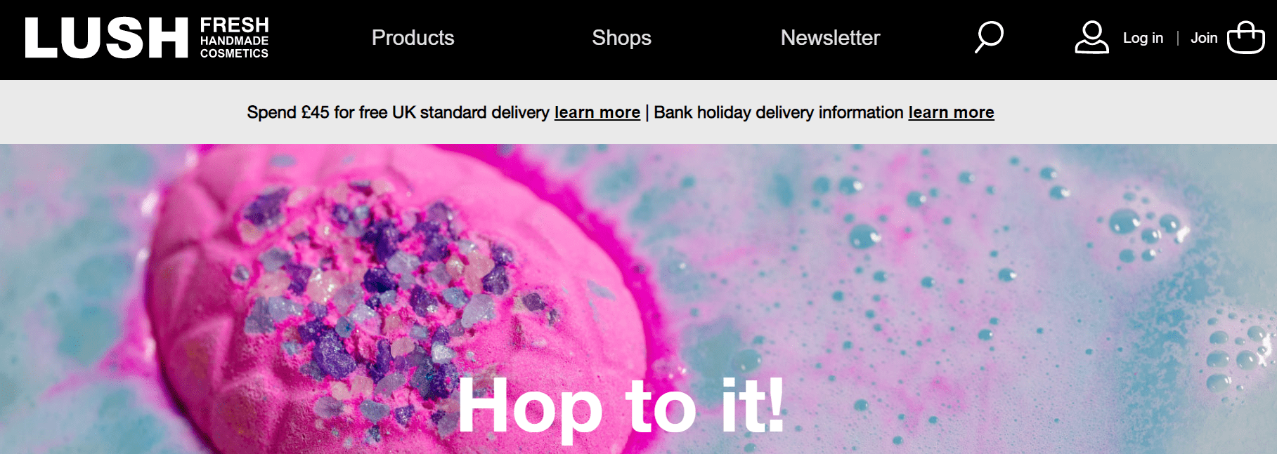
6. Take advantage of Email Marketing
Email marketing is a simple way for sellers to connect with their customers. Merchants can send targeted messages to buyer segments that address the specific desires of each group. By appealing to buyers’ interests, email marketing is an influential tool for increasing sales revenue.
There are numerous possibilities to ask customers if they want to receive email notifications during the checkout process or in a pop-up window while scrolling. This is how Lush does it.
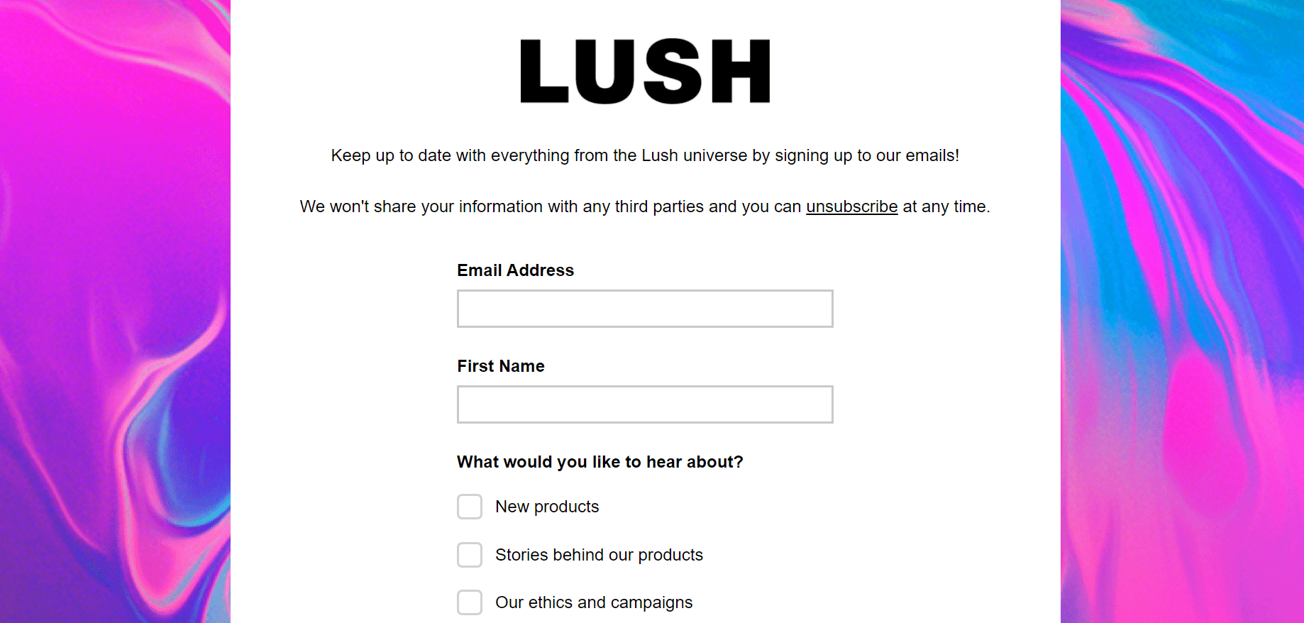
While not every customer will choose to enter your email list, those who do will be willing customers who are enthusiastic about your brand and will likely react well to your email marketing.
7. Provide a generous refund policy and a money-back warranty
Offering generous return and money-back guarantee plans will help retailers gain consumer confidence and encourage purchases. Allowing customers to redeem an item if they change their minds or do not fit the product description demonstrates to other customers that you respect your customers and want to offer value to them.
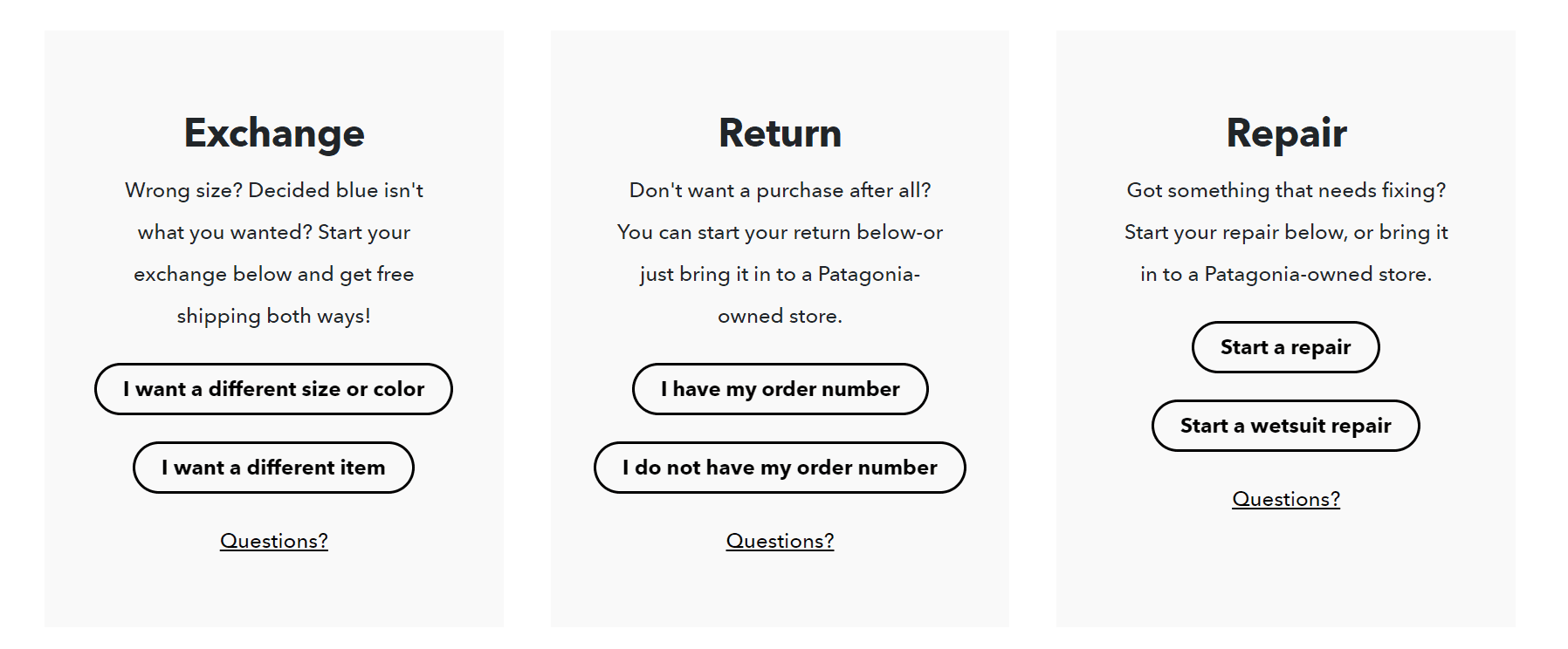
Just like Patagonia does. People are not risk-takers by default, so that this flexible payment policy would cater to them. As a result, you’ll be able to draw more clients than if you didn’t offer a money-back guarantee.
8. Provide incentive schemes
Store owners can take advantage of this power by providing benefits to customers. For example, retailers can constantly reach out to customers with various offers to make purchases, whether it’s a pop-up coupon on your store’s homepage or a promotional email about an ongoing sale.
Here’s Lush’s example where you’ll see a pop-up window offering free delivery. And who doesn’t love that?
Here are some useful hints for creating incentives:
- Using pop-up discount boxes on your site only when necessary.
- Using pop-ups to bombard your site visitors will possibly irritate them and drive them away from your shop.
- Keep track of the coupon codes that are frequently used to see the ones that resulted in the most sales and can be used again in the future.
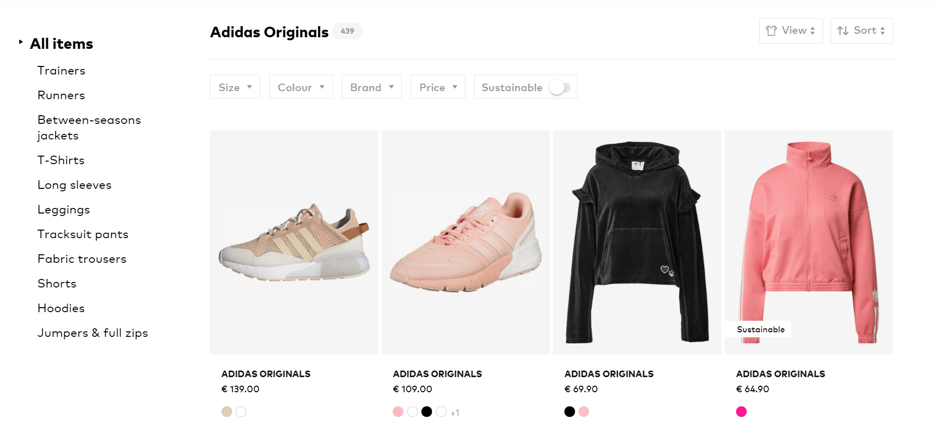
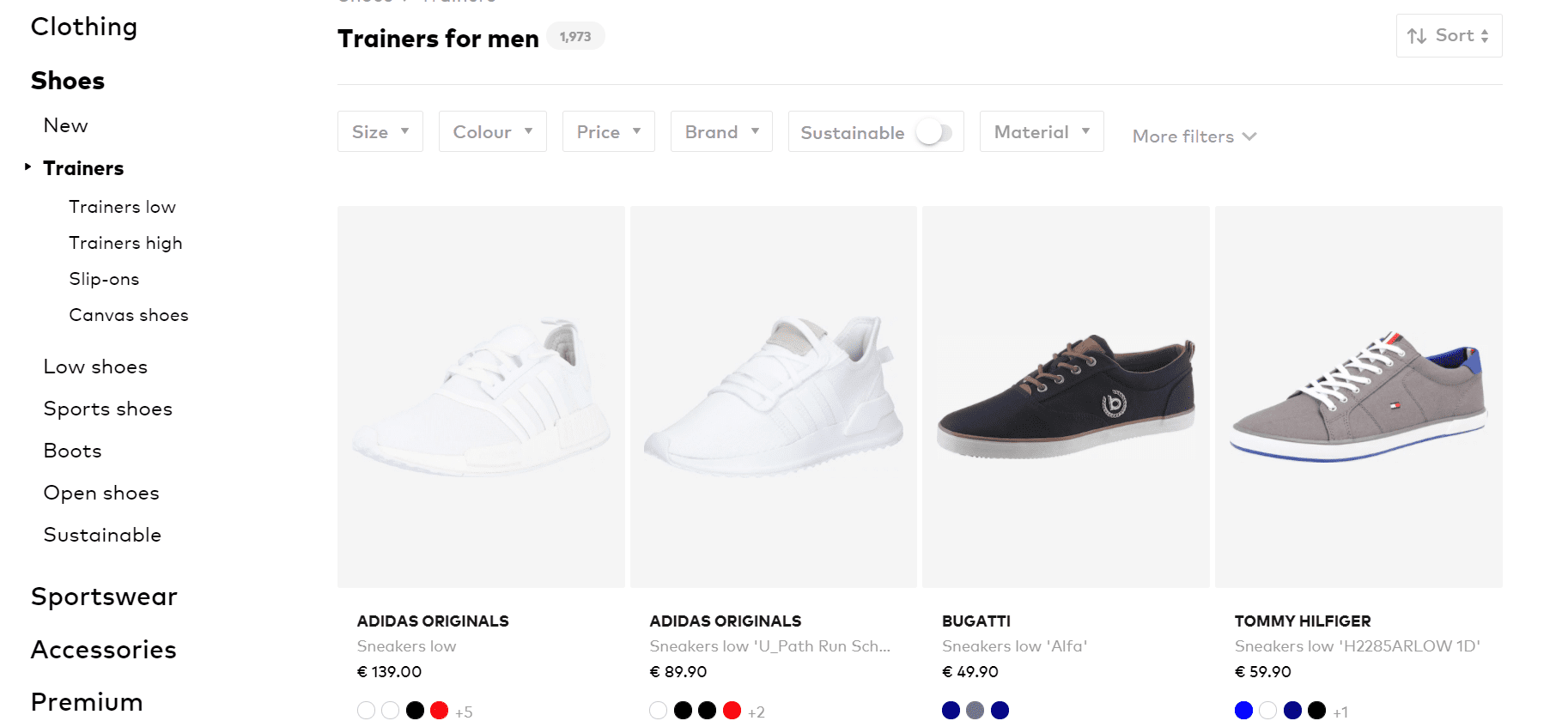
9. Use Filters Wisely
Filters assist website users in quickly locating the items they need. Optimize the types of products and services you sell to create the best shopping experience for your customers. Filtering by brand, size, color, and occasion, for example, is likely to be successful if you sell items such as clothes and shoes. Check out the example below by About You.
10. Increase conversion rates by curating your store
There’s nothing quite like finding a shop that feels tailor-made for you, whether it’s online or in person. You know, the “take all my money” feeling you get when you find a store where you might spend hours browsing. That’s curation at its finest.
Fashion is all about having a strong first impression, whether on a first date, at a job interview, or just in everyday life. It reflects who you are and how you want to be viewed by others. The same is true if you run an online fashion company… just in a different way. Even more difficult, each touchpoint in the customer’s journey generates a new first impression.
Conversion rate optimization is a broad term that refers to making minor changes to your website to enable visitors to take actions that your organization describes as “conversions.” Signing up for your email newsletter, posting a product on social media, enrolling in your loyalty program, writing a review, and, of course, making a purchase are all examples of this.
Things that DO NOT work – Thank us later
- Hidden Pricing
Uncertainty about a product’s price is one of the items that irritate consumers the most. As an example, consider Xiaomi UK. Xiaomi is very good at displaying SOME of their pricing, but purchasing a phone can be a total nightmare.
If there’s one thing people most definitely hate, it is wasting time. For example, if you were to buy this mobile phone, you would have to dig deeper than gold to find its actual price, and that can very well make you less likely to buy it and more likely to leave the website.
- Poor Images and Videos
It goes without saying that you should have high-quality photographs of your goods on your eCommerce website; however, just because you have a lot of photos doesn’t mean they’re all useful. So let’s take a look at a website that uses numerous images, doing more damage than good.
To be honest, nobody wants to see this unfortunate series of photos. The anchor and hook of most decent website designs is great photography. On the other hand, poor photography can turn people off and repel the very people you want to engage. Therefore, you must determine what distinguishes good photography from poor photography.
- Inadequate product descriptions
One of the most aggravating aspects of online shopping is that consumers cannot communicate with the items they are purchasing. They are unable to pick it up, feel it, measure it, and so on. Most consumers are aware of this and can cope with it, but only if the product details are adequate. Here’s an example of a jacket description:
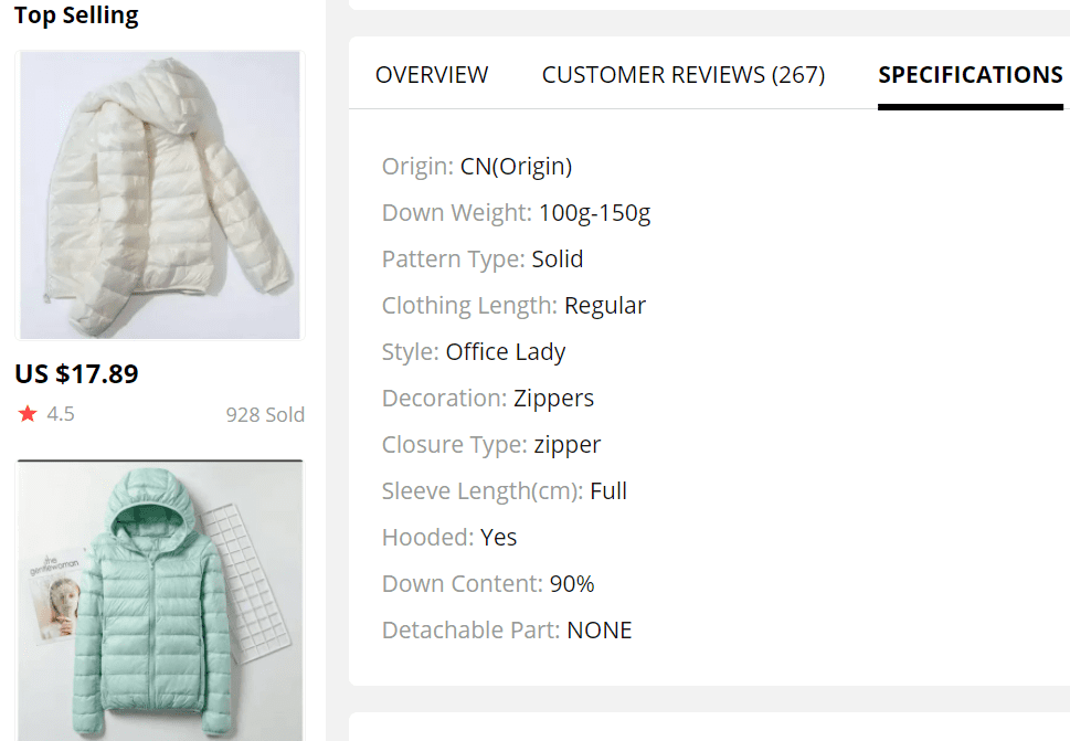
When creating a product description, it’s important to make it as simple as possible for your users to get the details they need about your product while staying brand and simple.
- Messy Categories
A well-designed website will always place navigation first. When you design a website for a specific audience, you risk isolating users and causing them to leave. This is why it is crucial to have all your categories, subcategories, and sections well-established, so when customers are looking for something, they won’t end up seeing this:

- No Reviews
Reviews will help your eCommerce site gain reputation and authority and encourage your customers to become brand ambassadors, but be wary of fake reviews.
You should always have a strong review triage procedure in place, even if it’s just to show your fellow users that you value the time they take to leave a review and that you’re actively assisting customers who aren’t happy with their purchase. Similarly, if a customer leaves a bad review and you don’t seem to be doing anything about it, it may damage your business, so you might want to keep this in mind.
Take-home message
Of course, the most obvious takeaway here is that you should understand your consumers’ preferences and interactions with your brand.
As previously stated, gaining access to the information provided in this article will allow you to make changes to your products and services that matter to the people who keep your business afloat.
What do you prefer now that you’ve seen some examples of good design and poor design for eCommerce websites? How does your website fare? Have you made some of the blunders you’ve seen? Let us know in the comments section below. We’d love to hear from you.

Gabriella is a Digital Content Writer and Marketer with a zeal for all things WordPress. When she’s not researching and drafting the upcoming articles, you can find her in the open air exploring the outdoors with her dog.

Comments are closed